GABS Festival

TOP 10!

The GABS Can Design Awards, presented by Orora in partnership with Opal Specialty Packaging, is excited to announce the top 10 finalists, selected by public voting! After careful deliberation, our expert judging panel has determined the final rankings, and the winners have been revealed! Grab a cold beer and explore these top selections in our virtual gallery below. Congratulations to all the winners!

#1

Beerfarm

Fruitasaurus Rex

Steffi Schmidt

A T-Rex, as the most famous dinosaur, is an integral part of popular culture and thus loaded with meaning and anticipations. The aim was to rethink that existing image by putting it in a new context that allow a new perspective. The fusion of two elements (T-Rex and the pinball game) which seem so far away enables exactly that try. In using the famous and well known pinball game it was possible to give a point of identification to a wide audience and a ground for people to connect over a beer.

#2

Seven Mile Brewing

Snozzberry Mixed Berry Sour

Greg Hodgson

#3

Dangerous Ales

Nelson Ha-ha DDH Hazy IPA

Emily Reid

#4

Helios Brewing Company

Dionysus Oat Cream Double IPA

Rob Munster

Have fun with it! Even Greek gods need to let their hair down and party!

#5

Seeker Brewing

Red Wizard

Daniel Anderson

#6

2 Halfs Brewing Distilling

Akira

Darcy Godwin

#7

Bonehead Brewing

God Mode

Matt Brick

While the graphics of 1993’s Doom don’t cut it in today’s gaming landscape, we wanted to make it feel like our customers where in looking through the games POV and taking down a demon with a beer instead of a gun. The illustration, type treatment and HUD are all directly inspired by the game marketing, packaging and in-game graphics.

#8

Blackflag Brewing

Wall of Death

Ross Holloway

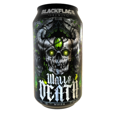
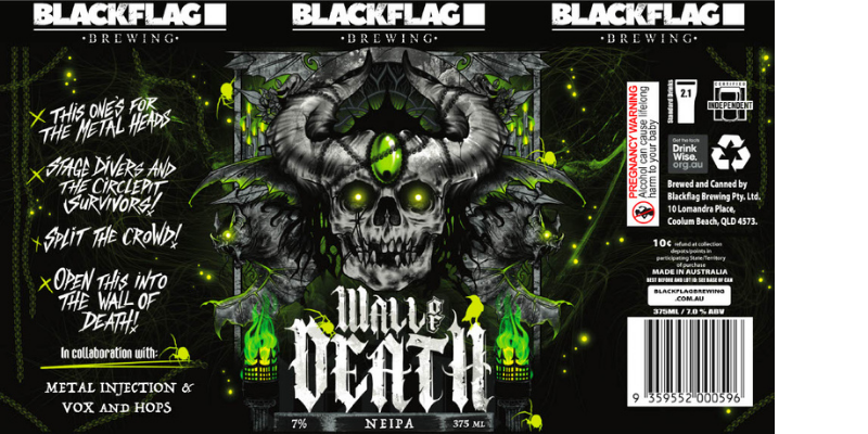
This raw inspiration behind “Wall of Death,” a beer as bold and intense as the music that fueled its creation. The can’s design reflects this spirit—its striking, high-contrast colors and jagged, aggressive lines echo the chaotic force of a metal concert.

A towering wall of skulls and flames adorns the can, symbolizing the wild, crowd-surfing spectacle that gave the beer its name. Every detail, from the gritty textures to the menacing typography, is a tribute to the power of metal music and its ability to ignite the soul. With each sip, experience the fusion of craft and chaos, and let the Wall of Death take you on a ride through the heart of heavy metal.

#9

Aether Brewing

Barrel Aged Breakfast Stout

Emma D’Anna in collaboration with Dan Brook

The vision for this label was a reflection of our journey that hearkens back to days before our brand evolution and to the beer ‘Respite’ the spiritual predecessor of Barrel Aged Breakfast Stout. Since our brand evolution we have forged a new path, steering away from the darker “skull-centric” style we were previously known for. However, with this label we wanted to pay homage to our past, acknowledging where we came from, while stepping into the future. ‘Respite’ featured a skull with gold highlights and Old English font so the new label had to represent these key elements. Our Artist Amplifier Initiative has over 1000 artist submissions including Dan Brook, who’s artwork ‘Harvest Time’ was instantly picked as the piece to carry the ‘Respite’ legacy onto our Breakfast Stout. From the skull to the yellow gold moon and the Old English long sword, the different elements of this artwork reflect the original ‘Respite’ label while representing our new style and values.

#10

Frenchies Brewery

Black Coconut Milkshake IPA

Jaz Lynch

Given the Milkshake IPA style of this beer, we envisaged a fun, playful take on the classic milkshake, with a little bit of nostalgia thrown in for good measure thanks to the presence of the straw. The Coconut Milkshake IPA features a pretty unique combination of ingredients – Madagascar vanilla, Tonka beans and coconut cream, so the presence of chunks of coconut, as well as the overall colour palette were designed to showcase them in a unique and eye-catching way.

presented by

in association with