GABS Festival

TOP 10!

The GABS Label Design Awards presented by Orora, is excited to reveal the top 10 finalists, chosen by public voting! These designs, listed in alphabetical order, are now under review by our expert judging panel to determine the final ranking. Grab a cold beer and explore these top selections in our virtual gallery below. Stay tuned for the announcement of the winners!

Abandoned Brewery

Hazy 17

Aaron McKirdy

Honestly, it’s really hard work coming up with a uniquely engaging label time and time again. And THEN, just to add insult to injury, you’re asked to write about the “design inspiration”. But who actually cares? No avid beer drinker wants to read the pretentious ramblings of some marketing design wanker. We put a busted up toilet on our can. Why? Well, we could say it’s a lame “decent piss” pun — haha do ya get it? DO YA!? But truthfully, we did it cos we could. And nobody else would. NEVER SAY DIE.

Alibi Brewery

Ruru - Hazy Pale Ale

Logan Gubb

b.effect Brewing Co

Hut People Stout

Lisa Nicole-Moes

The Southern alps are famous for their epic backcountry huts. We have used that as the inspiration for our Hut People stout. Whether you’re a hut person or not this straight up delicious stout will fill your boots after your next mission!

Behemoth Brewing Company

Victory at Churly's Bourbon Barrel Aged Imperial Porter

Nick Lurman

Behemoth is a very fun brand that offers a load of freedom when it comes to expressing itself. So, we could lean into Ballast Points distinctive use of skeletons, pirates and highly detailed artwork on this design to help amalgamate these 2 brands together almost seemlessly. The main inspiration pulled from Victory at Sea which was a part of the blend which.

Being able to reimagine a completely different art style than we usually use, and to just go a little crazy with depicting Churly as a zombie skeleton pirate captain. We also wanted to include the use of gold foil like effects in the label as this was a limited decadent beer to further elevate the design.

Canyon Brewing

Be Here Now - Hazy Pale Ale

Mikaela Turner

Heyday Beer Co

Galactic Grounds Dirty Chai Latte Stout 6.9%

Hannah Blackwood

Hop Federation

Hold the Line NZIPA

Evan Matthews

The idea of ‘escapism’ for the audience weighed heavily in the design process whilst ensuring that the brand icon of the hop was still the singular focus. The audience literally must view the beer through the icon of the hop. The connection to the New Zealand bush pays homage to the very essence of being present to the land and the gifts it provides. Hold the Line is just this — a moment of reflection. This also served us well for creating strong digital assets.

Isthmus Brewing

Pineapple and Lime Sour

Dave Quinlan

Bold and bright colours, containing images of the fruit, minimal writing, metallic writing, able to be used as part of a series of releases so there can be multiple iterations with the same general design but different fruit and different colourway.

Small Gods

Hexenhaus

Luke White

While thinking about what we could call our traditional Roggenbier I recalled good times in an old tavern named the Hexenhaus in the Alps. German for ‘witches house’, the Hexenhaus was a tavern filled with occult trappings and artefacts along with a couple of goats. A naive approach with a nod to medieval woodcuts seemed appropriate for my vision of a small witches house in an eerie forest of dead trees. The Kraft paper stock was carefully chosen as the closest thing I could get to goatskin parchment and a lot of thought went into finding the perfect typeface to communicate our story.

Sprig + Fern Brewing Co.

The G.O.A.T Doppelbock

Corey Harbrow

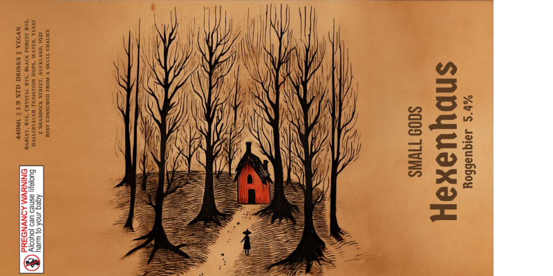
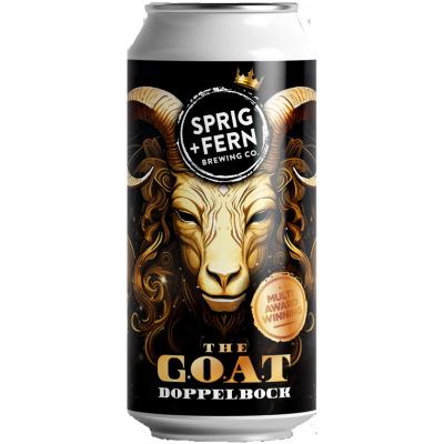
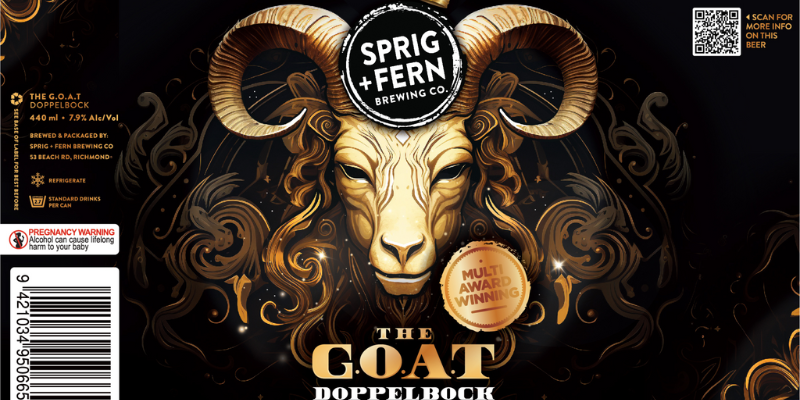
The G.O.A.T Doppelbock is Sprig + Fern’s most awarded beer, and as such we felt it deserved a design that better reflected it’s status as a multi-award-winning, premium quality product. In keeping with the ‘bock’ theme (German for goat), and the moniker of G.O.A.T (Greatest Of All Time), a bock head sits front and centre in a style inspired by the dark characters of Guillermo del Toro movies, with an air of mysticism and intrigue. The fonts selected reflect those of American bank notes, while the subdued colour palette of black, bronze and gold – complete with vintage embellishments, sparkles, crown and ‘multi award winning’ gold badge – tie together to form a cohesive concept and solidify the premium, luxury look and feel.

presented by