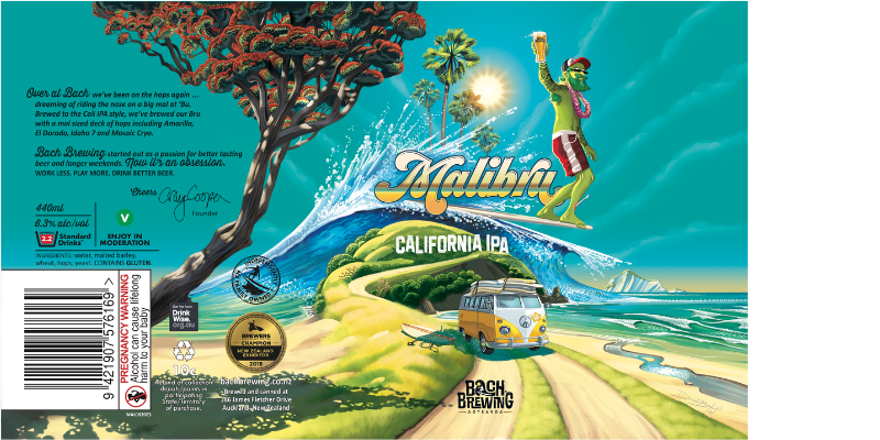
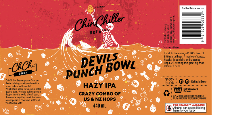
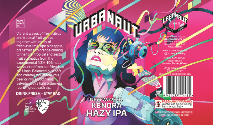
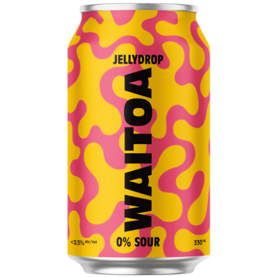
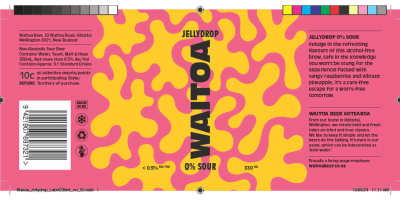
VIRTUAL GALLERY
The GABS Label Design Awards presented by Orora, is back for the fifth consecutive year! New Zealand’s digital can art gallery boasts beautifully curated works with something to suit all artistic tastes. Grab yourself a cold beer and take your time as you scroll through these eye-catching designs (listed in alphabetical order) featured in our virtual gallery below.
Abandoned Brewery
Hazy 17
Aaron McKirdy
Alibi Brewery
Ruru - Hazy Pale Ale
Logan Gubb
The story of Ruru revolves around our resident owl who lives in the wetlands of the Tantalus / Alibi Estate.
One day, as guests were strolling through the grounds, the owl, in a state of distress, flew out of the trees and collided with them before tumbling to the ground. The poor native bird had become entangled in the sticky seeds of the deadly Parapara tree, rendering him unable to fly. We quickly transported him to a native bird rescue center, where he was carefully cleaned and nursed back to health. Once recovered, he was released back into our wetlands, where he was joyfully reunited with his mate, and now happily resides.
The decision to feature this quirky tale on the back of our can came from our Head Brewer, Jody, who, on the early morning of brewing this beer, could hear our Ruru friend cheerfully calling out before sunrise.
b.effect Brewing Co
Hut People Stout
Lisa Nicole-Moes
The Southern alps are famous for their epic backcountry huts. We have used that as the inspiration for our Hut People stout. Whether you’re a hut person or not this straight up delicious stout will fill your boots after your next mission!
Bach Brewing
MALIBRU California IPA
Donovan Bixley
Beers by Bacon Bros
Cashmere
Tom Graham
Behemoth Brewing Company
Victory at Churly's Bourbon Barrel Aged Imperial Porter
Nick Lurman
Being able to reimagine a completely different art style than we usually use, and to just go a little crazy with depicting Churly as a zombie skeleton pirate captain. We also wanted to include the use of gold foil like effects in the label as this was a limited decadent beer to further elevate the design.
Brothers Beer
Saison D’être - Belgian Saison
Helena Olsen-Arts
It nods to traditional Belgian beer labels, capturing the charm of a Belgian farm and the golden fields that produce the grains used in our brew. The label pays homage to the authenticity and tradition that define Belgian beers.
Burkes Brewing Co
Seven Day Weekend Apres Lager
Alesha Plew
Bright bold, design that is fun and brings cheer to peoples days on the slopes or at the bar.
Canyon Brewing
Be Here Now - Hazy Pale Ale
Mikaela Turner
With this greater cause at the root, we wanted to create a label that was inspired by the area’s natural beauty, showcasing its breathtaking hikes, pristine national parks, incredible biking trails and luscious lakes and mountains. It serves as a reminder that indulging in low to no emissions adventures is not only possible, but crucial for preserving the beauty of the Southern Lakes area.
Our hope is that this can becomes the adventure buddy to all that explore the area, and serves as a reminder of Queenstown’s unique beauty and the importance of protecting it.
ChinChiller Brewing
Devils Punch Bowl - Hazy IPA
Simon Courtney
Eddyline Brewery
Eddyline Brewery Midnight Harvest Fresh Hop Black IPA
Lauren Turner
The Midnight Harvest Fresh Hop Black IPA can design by Eddyline Brewery NZ embodies the mystery and allure of a late-night hop harvest. Inspired by the rich, dark hues of a moonlit sky, the can features deep blacks and shadowy tones, contrasted by the vibrant green of freshly picked hops. This juxtaposition symbolizes the unique blend of roasted malt character and fresh hop flavour that defines the beer. The design evokes the energy and anticipation of harvesting hops under the stars, capturing the essence of a brew that’s both bold and refreshing. By integrating elements of nature and night, the can reflects the craft and care that goes into creating this seasonal, limited-edition beer, making it not just a drink, but an experience rooted in the natural rhythms of hop farming.
Emerson's Brewery
Emerson's Wilding NZ Farmhouse Ale
Luke Johnson
Garage Project
Hazy Pernicious Weed
Tim Gibson
The goal was to take the popular Pernicious Weed artwork, and B-movie-inspired story and spin it in a new, hazier, direction, like a Hammer-Horror movie sequel featuring the iconic threat of massive hop monsters, but with enough new elements and excitement to attract an audience of old and new friends. The over-the-top artwork reflects Garage Projects long-standing approach to ‘punchy art’ and pop culture awareness, while also giving drinking a clue as to the experience of the liquid inside the can.
Hallertau Brewery
Hallertau Haterade 2024
Ryan Henderson
Inspriration was the lightening bolt from the label which turned into a David Bowie / Bad Brains style iconic bolt across the can in metallic gold that you cannot miss. The colours really pop for us and it the beer stands out from our other range of beers which are of a more simple design. The beer is bold and different from the the rest of our range and the design really reflects that.
Heyday Beer Co
Galactic Grounds Dirty Chai Latte Stout 6.9%
Hannah Blackwood
Galactic Grounds blends the vastness of space with the comforting warmth of a chai latte. The digital painting style of the label transports you where floating space whales drift among the cosmos. Here, “Galactic” captures the ongoing space fantasy of Heyday’s stouts & porters, while “Grounds” leading to the coffee flavours in the stout.
Hop Federation
Hold the Line NZIPA
Evan Matthews
The idea of ‘escapism’ for the audience weighed heavily in the design process whilst ensuring that the brand icon of the hop was still the singular focus. The audience literally must view the beer through the icon of the hop. The connection to the New Zealand bush pays homage to the very essence of being present to the land and the gifts it provides. Hold the Line is just this — a moment of reflection. This also served us well for creating strong digital assets.
Isthmus Brewing
Pineapple and Lime Sour
Dave Quinlan
Morepork brewing
Whirlpool Hops West Coast IPA
Troy Collier
Morningcider
Cider Sangria
Louise Giles
North End Brewing
Evolutas 3 Year Aged Wild Ale
Alex Brimmicombe
This brew has an amazing story to bring it to fruition. Three years barrel aged and spontaneously fermented by microbes found in the air on Kāpiti Island. It’s created a beer that’s a true experience to drink. Such a brew is very true to our way of taking traditional styles and bringing them to life with a modern touch. The can reflects this by focusing around sharp geometric matte metallic gold line-work and fonts, which encapsulates our contrasting hand drawn graphic. This graphic depicts the traditional pitchfork and barley reflecting the beers origins, intertwined with the swirling Kāpiti winds bringing microbes through the air.
Small Gods
Hexenhaus
Luke White
While thinking about what we could call our traditional Roggenbier I recalled good times in an old tavern named the Hexenhaus in the Alps. German for ‘witches house’, the Hexenhaus was a tavern filled with occult trappings and artefacts along with a couple of goats. A naive approach with a nod to medieval woodcuts seemed appropriate for my vision of a small witches house in an eerie forest of dead trees. The Kraft paper stock was carefully chosen as the closest thing I could get to goatskin parchment and a lot of thought went into finding the perfect typeface to communicate our story.
Sprig + Fern Brewing Co.
The G.O.A.T Doppelbock
Corey Harbrow
The G.O.A.T Doppelbock is Sprig + Fern’s most awarded beer, and as such we felt it deserved a design that better reflected it’s status as a multi-award-winning, premium quality product. In keeping with the ‘bock’ theme (German for goat), and the moniker of G.O.A.T (Greatest Of All Time), a bock head sits front and centre in a style inspired by the dark characters of Guillermo del Toro movies, with an air of mysticism and intrigue. The fonts selected reflect those of American bank notes, while the subdued colour palette of black, bronze and gold – complete with vintage embellishments, sparkles, crown and ‘multi award winning’ gold badge – tie together to form a cohesive concept and solidify the premium, luxury look and feel.
SUNSHINE BREWERY
Sonic the hop hog
Kahu Jakicevich
The hog, cleverly designed to evoke Sonic’s spirit, zooms through emerald fields of fresh hops, leaving trails of flavor in its wake. The bright, electric greens and deep blues on the label mirror the refreshing and bold taste of the brew inside, promising a nostalgic yet invigorating experience. Whether you’re a gaming enthusiast or a hophead, this limited-edition beer is your ticket to a taste of classic gaming culture with a Sunshine Brewery twist.
Swifty
Swifty - Refreshing Beer
Amanda Gaskin
Swifty is a collaboration between Royalburn Station and Garage Project – celebrating a farmer and a brewer teaming up to create a high quality yet simple refreshing beer. The design is a throw back to classic draught beers, and to pay homage to Central Otago and the Crown Terrace where the Royalburn spray free malt is grown. Swifty is a beer for everyone and we wanted the design to reflect that. It’s straight up, does what it says on the tin and is making us thirsty even just thinking about it. You beauty!
Two Thumb Brewing
SNAKE - WCIPA
Paris Tutty
Urbanaut Brewing Co
NEW WAVE 01 KENORA HAZY IPA
Pablo Espinosa
Volstead Brewing Co
Fools Gold
Jason Ray
West Coast IPA is the beer style and the West Coast of New Zealand has a rich history of gold mining, so it’s a play on that, as well as the idea of liquid gold to reflect the beer colour.
Waitoa Beer
Jellydrop 0% Sour
Mike Peters
proudly brought to you by