GABS Festival

VIRTUAL GALLERY

The highly anticipated GABS Can Design Awards presented by Orora, in partnership with Opal Specialty Packaging, is back for the fifth consecutive year! Australia’s biggest digital can art gallery boasts beautifully curated works with  something to suit all artistic tastes. Grab yourself a cold beer and take your time as you scroll through these eye-catching designs (listed in alphabetical order) featured in our virtual gallery below. 

All voters will be entered into a draw to win one of 100 tickets to GABS 2025! 

2 Brothers Brewery

Bigfoot Brown

Hayden Whelan

After discussing with the team, we came up with a name for the beer before the design. This shaped the inspiration for the label.

2 Halfs Brewing Distilling

Akira

Darcy Godwin

3806 Brewing

Hazy IPA

Callum Warren

The vision and inspiration behind the design of 3806 Brewing’s hazy IPA can were all about capturing the fun and excitement of a mountain adventure. We wanted the can to feel like a mini escape to the great outdoors, with bold and vibrant colors that pop, just like the beer inside.

Imagine cracking open a cold one and feeling like you’re standing on a mountain peak, soaking in the views. That’s the vibe we were going for—something that screams adventure and makes you want to explore. It’s not just a can; it’s a little taste of freedom and fun, perfectly matching the refreshing, hazy goodness of the IPA. The design is all about celebrating good times and great brews, making every sip feel like a mini getaway!

4 Pines Brewing Company

4 Pines New World Pale Ale

Aron Marchant

In this design, we wanted to create an approachable yet playful can that captured the cooling and refreshing properties of a liquid that has all the makings of an easy drinker, but still upholds a fruity hop backbone. Crafted for the new age palate, our New World Pale Ale gets its name from the modern hops used in the brew that make it more similar to an XPA over a traditional Pale Ale in its presentation, sessionability and pronounced fruity aromas. We felt the green used in the design provided a taste of the melon and citrus flavours of the liquid, offset by its deep purples to provide a refreshing and cooling effect. Born in Manly, the ocean has always been a key passion point for us, no different in this design. The New World Pale Ale design depicts a window out to a new horizon, one that we’re pretty excited for. As the tagline on the can says, the Future is Now. And what better time than now to get yourself a 4 Pines New World Pale Ale.

7th Day Brewery

Sour Puss

Nat Welsh

What better way to depict a beer titled ‘Sour Puss’ than with the very mystical creature that embodies the name. A fruity octopus dancing amongst a psychedelic ocean! Designed to give just a little teaser of the zesty Strawberry and Acai Berliner Weisse awaiting inside, this can is part of our 2024 Making Waves series. For the third year in a row, we’ve brought to life this series of 9 limited edition beers, partnering with a different artist each round to deliver their unique spin on our wildest of creations. Illustrated by this years artist Nat Welsh, Sour Puss has been designed to jump off the taproom shelf and wrap its tentacles around the tastebuds of anyone eager to indulge in a tart fruity brew!

Aether Brewing

Barrel Aged Breakfast Stout

Emma D’Anna in collaboration with Dan Brook

The vision for this label was a reflection of our journey that hearkens back to days before our brand evolution and to the beer ‘Respite’ the spiritual predecessor of Barrel Aged Breakfast Stout. Since our brand evolution we have forged a new path, steering away from the darker “skull-centric” style we were previously known for. However, with this label we wanted to pay homage to our past, acknowledging where we came from, while stepping into the future. ‘Respite’ featured a skull with gold highlights and Old English font so the new label had to represent these key elements. Our Artist Amplifier Initiative has over 1000 artist submissions including Dan Brook, who’s artwork ‘Harvest Time’ was instantly picked as the piece to carry the ‘Respite’ legacy onto our Breakfast Stout. From the skull to the yellow gold moon and the Old English long sword, the different elements of this artwork reflect the original ‘Respite’ label while representing our new style and values.

Alice Springs Brewing Co

PILLZ

Jessie Jungawalla

A psychedelic visual experience to go hand in hand with the PILLZ!

Amber Brewery

Golden Tears

Shannon Lancour

Area 51

EXOGENESIS

Aron Dobrowolski

Balter Brewing

'Loftus Express' Pacific Northwest Pale Ale (In Collaboration with Yakima Chief Hops & Loftus Ranches)

Ben Trueman

Barons Brewing

Redhead Strawberry Gum

Robb Beckmann

Batch Brewing Co

Marrickville Original


Clint Weaver

Bay Road Brewing

Bay Road BrewingFirst Contact Central Coast IPA

Nick Robinson

Beereratne Brewing & Blending

Modern Pentathlon - Quintuple Hopped WCIPA

Ben Weereratne

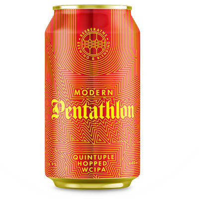
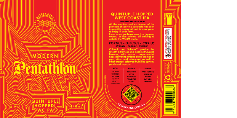
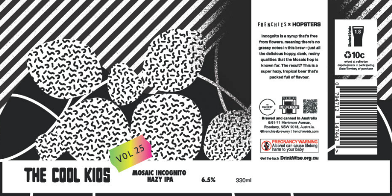
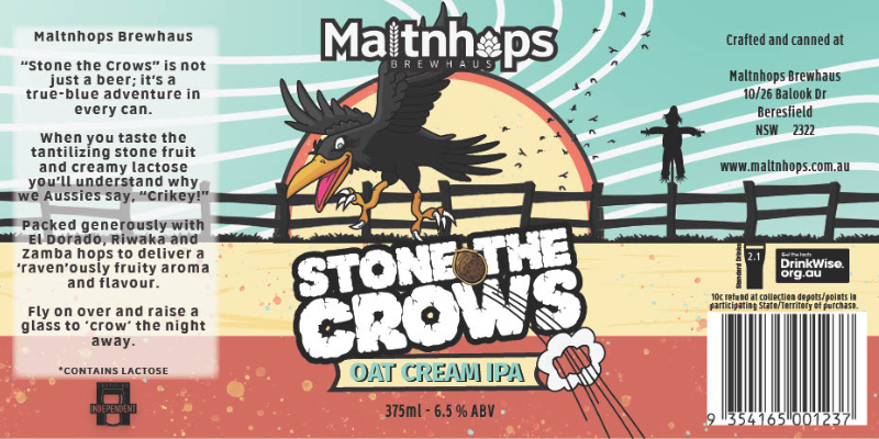
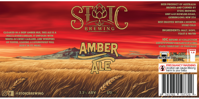
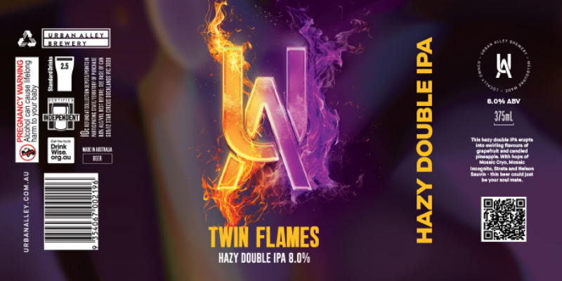
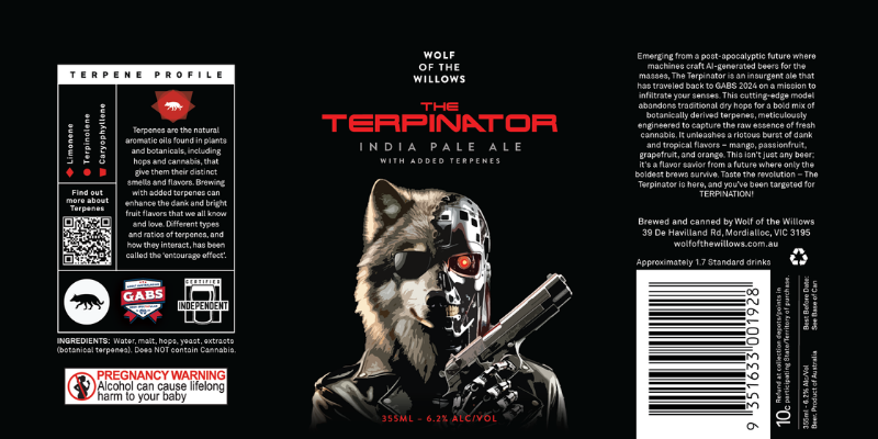
The name of the beer was decided early – Modern Pentathlon – it’s an Olympic year and it’s my favourite event. From there, everything was about the number 5. So five hops, five hopping events in five different vessels, five malts, 55IBUs.

The design vision came out of the shape of the number 5 with its contrasting curves, angles and straight lines. Two contrasting fonts were chosen – “Modern” in a geometric san-serif font, and “Pentathlon” in a classic gothic font that generates interesting shapes that draw the eye to the name of the beer. The concentric lines around the can evoke the lines on a running track.

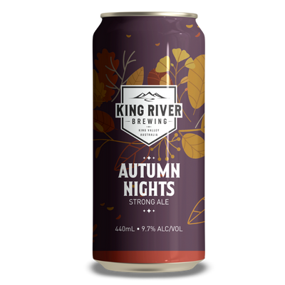
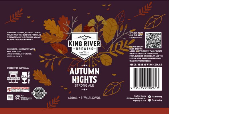
The metallic red and yellow lines were chosen to provide high contrast when seen up close, but appear orange like autumn leaves when in a fridge on display and seen from a distance. All the elements, brewery/name of beer/style and the regulatory elements interact with each other and wrap around the can seamlessly – taking advantage of the digital print process as well as the cylindrical shape of the can.

Beerfarm

Fruitasaurus Rex

Steffi Schmidt

A T-Rex, as the most famous dinosaur, is an integral part of popular culture and thus loaded with meaning and anticipations. The aim was to rethink that existing image by putting it in a new context that allow a new perspective. The fusion of two elements (T-Rex and the pinball game) which seem so far away enables exactly that try. In using the famous and well known pinball game it was possible to give a point of identification to a wide audience and a ground for people to connect over a beer.

BentSpoke Brewing Co.

Dick Tracy

Jayden Barling

The goal Dick Tracy design was to capture the essence of BentSpoke’s long tenure while keeping things modern for the celebration of our 10th Birthday.

Black Hops Brewery

Paradise Hazy IPA

Aidan Howes

Gold Coast, Summer, Holidays, Aspirational.

Blackflag Brewing

Wall of Death

Ross Holloway

This raw inspiration behind “Wall of Death,” a beer as bold and intense as the music that fueled its creation. The can’s design reflects this spirit—its striking, high-contrast colors and jagged, aggressive lines echo the chaotic force of a metal concert.

A towering wall of skulls and flames adorns the can, symbolizing the wild, crowd-surfing spectacle that gave the beer its name. Every detail, from the gritty textures to the menacing typography, is a tribute to the power of metal music and its ability to ignite the soul. With each sip, experience the fusion of craft and chaos, and let the Wall of Death take you on a ride through the heart of heavy metal.

Blackman's Brewery

Mango & Passionfruit Ice Cream IPA

Ash Oswald

The vision was to combine Blackman’s Brewery beach vibes together with the collaborators of this beer (Gelato Gelato & Hazy Squid beer-influencer). Bold ice-cream colours and bright Summer fun was always at the forefront of the design.

Bodriggy Brewing

Weird Weekender Hazy IIPA

Mathis Burmeister

Bondi Brewing Co

Long Ship Boarder Hazy IPA

Andrew Story

Inspiration drawn from our Bondi locale and the artists daily doodling.

Bonehead Brewing

God Mode

Matt Brick

While the graphics of 1993’s Doom don’t cut it in today’s gaming landscape, we wanted to make it feel like our customers where in looking through the games POV and taking down a demon with a beer instead of a gun. The illustration, type treatment and HUD are all directly inspired by the game marketing, packaging and in-game graphics.

Bowden Brewing

Soolong Sucka Tealeaf IPA

Georgia Butterworth

This is the cuppa for the hippest grandma in the land.

Braeside Brewing Co

Ten Dollar Cowboy

Charlie Tompson

The Wild Wild West.

Bread & Brewery

Return to Sender

Alyca Sutherland

As with all our beers, Return to Sender has a story. The story emerged during our journey to open the brewery as one of the business partners had too many mail addresses, when it came to licences and approvals, complications arose with mail being returned to sender. This particular business partner loves Batman, so the label inspiration for this beer is for a wannabe Batman to accidentally receive a Superman cape. 
 
The mix-up is meant to be a comical representation of the beer, which is a compilation of three styles smashed into one, and Oated Pale Lager, to pleasurably confuse the tastebuds as much as we were confused about all our partner’s addresses.

Brew Mountains Brewery

Origional B.I.G - English IPA

Mark (Turtle) McNamara

Mark (aka Turtle) at Blank Canvas got the brief and got to work on the old sailing ship with the barrel of Ale over board. We decided on the name “Original B.I.G” (Best In Group or Game). An eye catching name that dominated the front with the sailing ship. Also BOG because it’s a 7% IPA. And a nod to the Notorious BIG – RIP.

Brewboys Brewery

Piste Off

James Bobridge

Sure, some of us love winter. There are those who seek adventure, wandering and skiing the slopes of life. And then there are some of us that let the yeti take over and get piste off! Clean up your act. It’s almost Spring buddy, you don’t have to be so piste off anymore.

Brewcha Libre Brewing Co

Ryan Walker

Brick Lane Brewing Co

Trilogy of Fear: SOUL TRADER: LOVE Cascara and Chocolate Imperial Stout

Pete Johnson

WARNING: CARD WILL REVEAL IN DAYLIGHT

The Trilogy of Fear Series brings something unique and terrifyingly intriguing year after year. The vision behind the 2024 Series: Soul Trader was to let beer lovers take their destiny into their own hands. To tempt fate and test the courage of those who dare…

When exposed to daylight, using thermochromic ink, one of two tarot cards will reveal itself. Will the star-crossed lovers paths meet, or are you forever destined to walk the path of lonely street?

With two other beers in this year’s series and six possible outcomes, Soul Trader lets you escape the mundane, offering a light at the end of the tunnel. Be blessed by an unimaginable bounty as the card is turned over. Alternatively, the card may reveal a cursed despair.

Bright Brewery

Fresh Hop Monster Double IPA

Clint Weaver

With this beer being a collaboration with Kaiju, we wanted a monster (thus the name) that felt inspired by their brand but with a Bright twist to it. Using comic book inspired line work, hand drawn typography and a bold colour palette, the Hop Monster in question is raging over the HPA hop farms which sit nearby the picturesque Ovens River which runs through Bright. Is the monster destroying it? Or planting new hops? Who knows, but it’s angry!

Brisbane Brewing Co.

Clarence Ginger Beer

Emily Devers

Our building where Brisbane Brewing Co. Woolloongabba is located, and also the secondarily, the city of Brisbane itself.

Bucketty's Brewery

Manly Marlins x Bucketty's - Manly Lager

Tom Hadley

Most cans made for sporting teams are either split or ‘mirrored’ between the two with the one logo.

I tried to split between the Manly Marlins and Manly Mermaids; given that the girls have been successful in entering a 15s team in the Shute Shield competition for the first time in the clubs history this year, to celebrate in the can design.

There’s lots of new inspiration for the Marlins can this year with their ‘one club one village’ motto and a mamba mentality that is being encouraged around the club/trainings & training gear. Hoping the can design will unite the club and fans even more.

I have included a few club legends, icons, shute shields and more amongst the iconic ‘Buckettys’ Gum Leaves.

Burra Brewing Co

Citronic Black IPA

Michael Kavanagh

Cheeky Monkey Brewing Co

The Farm Hazy IPA

Brendan Day

The Farm is an extension of our Surf Break Series, which plays into the whimsical and at times abstract nature of how we create artwork of our popular South West Oz surf breaks. 
 
This surf break, The Farm, was our inspiration and plays into a slightly psychedelic feel, including a variety of animals into an ocean wave.

Co-Conspirators Brewing Company

The Outsider Red Rye IPA

Clint Weaver

The beer name of “The Outsider” took us down the path of the 1987 Francis Ford Coppola film The Outsiders, a coming-of-age crime drama featuring several double-denim clad youths. Lucy of Goodland painted a denim inspired background, upon which our double-denim wearing protagonist appears, the character himself subtly featuring the logos of both brands within its design.

Common People Brewing Co

Spicy Boi Chilli Margarita Cerveza

Sophie White

The Spicy Boi Chilli Margarita has the ingredients of a classic marg, including fresh lime juice and salt but with the addition of habanero chillies from a nearly chilli farmer and friend of the brewery. The base of the beer is a Mexican style cerveza, so between that and the margarita, it made sense to us to draw on Mexican influences for the can design. The tasting notes talk about “bringing the heat all the way to your bones”, hence the “Day of the Dead” style skeleton taking a midday siesta under the shade of his sombrero! We loved the design so much that we ended up producing a merch range and some stickers to compliment the seasonal release.

Communion Brewing Co

Great Southern

Loryn Engelsman

We needed a premium mid strength to add to our core range, and we wanted the design to strike a cord with the mass beer market, because they seemed to like a fish drawing on their beer. Our local fish hero is the very ugly Flathead, so we set about immortalising it via the very talented graphic designer Loryn Engelsman.

It was very important that the beer fitted into our core range design, which dictates that the beer type is front and centre (Premium Mid), allowing for easy identification in bottle shops, and the beer name (Great Southern) along the top if our main gaphic.

Coopers Brewery

Coopers Botanic Ale

Jonathon Jones

We were looking to create a fresh take on our 162 years of brewing heritage.
This unique beer is a surprising twist on our Aussie icon Sparkling Ale so we wanted to capture a design that had modernity, was fresh and approachable whilst driving intrigue with craft beer drinkers and loyal Coopers drinkers alike.

Copperlode Brewing Company

Gingeroo

Sheryn Brewert

This beer was crafted in partnership with the Gulf Region Aboriginal Economic Trust, a social enterprise dedicated to providing investment and economic assistance to native title groups and communities in the Gulf area. The design aims to mirror the Gulf’s landscape. The Red Kangaroo, or Ngardarda, is featured prominently as it is of great importance to the Gangalidda people of the region. Its significance stems from its tenacity, mirroring the local people’s relentless fight for the preservation of their communities and heritage. Additionally, the design highlights the region’s natural splendor, inviting visitors to explore and contribute to the Gulf communities’ support.

Cornella Brewery

Vicious Annie

Adam Collins

I wanted to take the recognisable colour palette and key illustration of the core “Annie” can and throw fistfuls of attitude at it – the name “Vicious Annie” immediately took me down the path of punk rock (which is apt as the Cornella crew are no strangers to raucous tunes) and the iconic and fun imagery intertwined with it.


The teal, orange and yellow are all retained, albeit now featuring torn / worn textures and intentionally garish patterns and handmade punk rock typography. I wanted to keep the friendliness of the original can so created a new version of the Annie illustration, complete with tipped mohawk, studded leather jacket and chains (of course I used a spot metallic on all the studs / chains / zippers for added effect).


I love any opportunity I get to add some fun little surprises into the artwork and really leaned into it here (see references to classic dog punk bands like “Bark Flag”, “Minor Treat”, “Hüsky Dög”) amongst other numerous punk rock references for those who dare to delve into the art.

Dangerous Ales

Nelson Ha-ha DDH Hazy IPA

Emily Reid

Earth Beer Company

Bush Tucker Saltbush Gose

Aidan Howes

G’day Folks! Our vision was to capture Australiana in all it’s beauty, by showcasing our unique flora & fauna. The centrepiece of the design being one of our most beloved native & local bird species, the Yellow-Tail Black Cockatoo, clutching some Saltbush in its claws, one of the native bush tucker ingredients used in this special brew, along with Mount Pepper Berry & Davidsons Plum. With the addition of the rainforest mountain ranges surrounding our Northern Rivers home, under a starry moonlit evening, finished off nicely with some earthy pastel colours. Our imagination came to life! Take your taste buds on a fantastical flight with the Bush Tucker Gose, proudly brewed by Earth Beer Company.

Frenchies Brewery

Black Coconut Milkshake IPA

Jaz Lynch

Given the Milkshake IPA style of this beer, we envisaged a fun, playful take on the classic milkshake, with a little bit of nostalgia thrown in for good measure thanks to the presence of the straw. The Coconut Milkshake IPA features a pretty unique combination of ingredients – Madagascar vanilla, Tonka beans and coconut cream, so the presence of chunks of coconut, as well as the overall colour palette were designed to showcase them in a unique and eye-catching way.

Funk Drinks Co

Strawberries and cream

Liza Avelino

The vision behind the design of our strawberries and cream cider label at Funk Drinks Co. is to highlight our main ingredient: fruit! Our ciders are made with natural, local fruits that are cold pressed in our production facility. We wanted to highlight the essence of fresh, sun-ripened strawberries paired with the smooth, creamy texture of vanilla. The design features vibrant reds and soft cream tones, creating a visually appealing and inviting look that reflects the sweetness and richness of the cider.

The inspiration behind the design of the can came from a nostalgic treat loved by many Australians: Creme Savers in the strawberries & cream flavour, and also Allen’s strawberries and cream lollies.

Gage Roads Brew Co.

Shred Betty Juicy IPA

Sophie Osborn

Originally this release was called Big Betty, after our Gage-branded FJ40 Land Cruiser. But in seeking some visual inspo for the design, we found some awesome imagery in old 80s surf magazine with female surfers (colloquially known as “Bettys”) shredding it up. So it felt right to call this release Shred Betty. I love the big colours and “thrasher” vibes.

Good Folk

POG Sour

Ben Hay

For a surfside sipper we wanted to visually represent the waves of tropical flavour you get from tasting the mix of passionfruit, blood orange and guava in this beer. It’s tart, then tangy, with a sweet finish. The coloured lines across the can are suggestive of those flavours across your tongue. Their playful movement is also a nod to the top view of the wave sets rolling into Waikiki.

Good Land Brewing Co

CANYON DUST - DDH Hazy IPA

Lucy Krekelberg – ARTWORK, The View From Here – DESIGN STUDIO

Green Gully Brewing

Dark Daze

Luke Smith

British-style ale flavor profile with our proprietary yeast strain what is dark and scary to most non craft beer drinkers
Barley being grown in the field with a dark storm brewing above.

Hargreaves Hill Brewing Co.

Chaos of the Universe - Apollo

Paul Sonsie

Hawkers Beer

Bourbon Barrel Aged White Stout - 2024

Christopher Flem

The idea behind this illustration was to create a design that captures the viewer’s attention from a distance using an attractive and harmonious colour palate and yet holds their gaze with an intriguing subject when up close. The juxtaposition of a skull and a snail is suggestive of the passage of time, alluding both to the time the beer has spent maturing in barrel as well as the slow but unrelenting ticking of age towards the inevitable fate of the viewer themself. Time can improve or time can destroy—but it is merciless nonetheless.

Heaps Normal

Tough Stuff Shandy

Maddison Holmes

It’s designed to reinforce the brand’s positioning – empowering a new generation of Aussie drinkers to make memories and stories to remember, without focusing on how much or how little alcohol they’re drinking. Instead, the new shandy and the accompanying campaign look to turn the stereotypes of traditional Australian drink advertising on their head by marketing the beverage as a drink for ‘tough everyday Australians jack-hammering their way down a sheer cliff-face after a hard day’s work repairing the Sydney Harbour Bridge.’

‘Looking back at the beer and soft drink ads of the 1980s, we reckon it’s again time for a beverage for tough, everyday legends whose blood, sweat and tears power our nation daily. But what’s changed since the 80s is what that tough stuff looks like, so we’ve found some of the toughest stuff in Australia today and profiled them as part of this campaign. ’ – Andy Miller, Heaps Normal co-founder and CEO.

We’re using the new Shandy and and the Tough Stuff campaign to redefine what tough stuff is and looks like in 2023.

Helios Brewing Company

Dionysus Oat Cream Double IPA

Rob Munster

Have fun with it! Even Greek gods need to let their hair down and party!

Heroes and Villains

Roadie

Luc Boprey

The design of this label was intended to reflect the “heavy lifting” band roadies are required to do. We put to Luc the idea of Brent Hinds because he has that grumpy, tattooed look that cliches of Roadies express. Luc took the ‘heavy lifting’ in the brief right out to Atlas holding the globe, then the idea of a human rhinoscerous, which explains where we ended a little…

The finish of the label is matt and metallic to give some differentiation between character and background and to provide the impression of movement. The metallic also provides a differentiation from other cans when in a crowded fridge – shimmering a little to gain attention.

Hip Hops Brewers

Aegir Nordic Ale

Shaun Reeves

Aegir Nordic Ale was created by our brewers at the request of the organisers of the Abbey Medieval Festival, the biggest of its kind in the Southern Hemisphere. The organisers wanted a beer as a shout out to one of the periods of history they celebrate. The brewers created an Ale using modern methods but with traditional ingredients such as juniper, carraway and pine needles. The inspiration for the name was Aegir, Norse god of the sea and of beer. Aegir and his wife Ran and their nine daughters would brew the beer for the celebrations of the gods. Our beer was blessed by our local Viking re-enactor groups with offerings made to Odin and his gods. The artwork is a picture of an original multiblock linocut piece depicting Aegir in a sea with foaming waves of ale. Skol.

Holgate Brewhouse

Dank AF West Coast IPA

Aaron Lodder

Hop Hen Brewing

Blowtorch Red Ale

Ben Weereratne

The inspiration behind this can was to pay homage the Hop Hen Brewing’s Chief Beer Slinger, Tim Somers, and his love of punk rock. This Red Ale is named after the song ‘Blowtorch’ by The Bronx and the label design draws inspiration from the Sex Pistols iconic album covers.

Hop Nation Brewing Co

Winter Storm - West Coast IPA

Phil Townsley

Who said West Coast was all sunshine and palm trees?

Hopsters Cooperative Brewery x Frenchies Brewery

The Cool Kids - Mosaic Incognito Hazy IPA

Jaz Lynch

The Cool Kids is a collaboration series by Frenchies Brewery and Hopsters Cooperative Brewery, where we spotlight the most innovative hops on the market. The artwork blends modern aesthetics with a nod to 80s vibes. For this particular beer, we opted for a bold, predominantly black-and-white design (a play on “Incognito”) that captures the understated elegance of the free-from-flowers Incognito syrup while highlighting the Mosaic hop. This approach inspired intricate illustrated elements reminiscent of traditional mosaic patterns.

Hudson Brewing

Phoenix Hazy IPA

Emily Donohoe

Impi Brewers

King under the Mountain

Jason Marais

Taking inspiration in The Hobbit with Smaug laying guard to the Lonely Mountain’s treasures, we had came up with a name, King under the Mountain. From there our vision was to have a medieval style red dragon sitting on a pile of gold inside of a cave.

KAIJU! Beer

Metamorphosis West Coast IPA

Mikey Burton

Many moons ago, when we had to change our name, it seemed appropriate for our first new bottle label as KAIJU! Beer to reflect a creature, metamorphosing in its hop cocoon, planning revenge on those that had interrupted it from its cushy pupal state. Our designer, Mikey, took our existing eye-centric theme and made it look super-pensive and sneaky. Obviously, we loved it and it has become something of an icon as our original KAIJU! Cut to many years later, and tastes have changed, both in flavour and aesthetic. We decided to overhaul Metamorphosis and its design to make more sense within our brand lineup. A slightly lower alcohol IPA, in the modern West Coast style, still dank but with some brightness shining through. This has been reflected in the new can design. Our brand is punchier, the style is clearer and all the important elements and imagery are showcased.

Kick Back Brewing

Southern Lights West Coast IPA

John Hargreaves

While we wanted to capture the namesake of this beer, the southern lights, we wanted to tie it back to Aldinga which is where Kick Back Brewing is located and a core part of Kick Back Brewing’s identity as a local craft brewery who is interested in and supports the Aldinga community. So we’ve created a scene of the Southern Lights at the beach, as Aldinga is known for its costal living and incorporated waves of the southern lights in the sky as an homage to the sea. We’ve also included the Aldinga community coming together to enjoy the lights, referencing Kick Back Brewery’s involvement.

Kicks Brewing

Love Child

Jessica Ibbett

The inspiration behind Love Child was nostalgia: high school crushes, rebellion and boredom. The idea developed from there into an old school classroom chalkboard that all the kids have graffitied in typical teenage fashion while waiting for their next class.

Killer Sprocket

Risa Sunrise

Matt Brick

We wanted the classic look of a travel postcard blending with the intergalactic travel destination and pleasure planet, Risa, from Star Trek to come across in a welcoming and easy to understand fashion. Whether you’re familiar with Star Trek or not, you should be able to see that this beer evokes tropical beachside feels and relaxing vibes.

If you’re Picard-ing a holiday with your face buried in a good history book or full-on Riker-ing your way into some more Jamaharon, you’re going to need some refreshment, and either way a Risa Sunset is the best thing for the end of any day!

King River Brewing

Autumn Nights

Dan Ellis

A strong and smooth pale ale with a hint of tart citrus and full mouthfeel. For cooler evenings, sitting by the fire, whiling away the hours with friends. As the leaves dance in the breeze, you can relax on these Autumn Nights.

King Road Brewing Co

Old School IPA

Jarrod Fuller

King Tide Brewing

Leap Day Hazy IPA

Sam Rowe

For a hazy IPA released on the quirkiest day of the calendar (Leap Day), we needed a can design that brought to life the mysterious and otherworldly possibilities that arise on the 29th February.

Local Brewing Co.

Hazy Nectarine Pale

Jesse Jungalwalla

The vision for our can design was driven by a commitment to sustainability and the creative use of surplus produce. We wanted to highlight the beauty and potential of nectarines that would have otherwise ended up in landfill due to blemishes or small size. The vibrant orange hues represent the freshness and quality of these rescued fruits. Our logo, featuring “diverting fruit from landfill” and the shape of a nectarine, underscores our mission to reduce food waste. By incorporating these elements, we aim to draw attention to the importance of sustainability in brewing and the innovative use of ingredients. The design not only makes a bold visual statement but also communicates our dedication to environmental responsibility and resourcefulness, inviting consumers to join us in appreciating and supporting sustainable practices.

Longstocking Brewery

Sapphire Coast Lager

Emma Godfredson

Design a can label for Sapphire Coast Brewery that epitomises the beaty and unspoilt nature of the Sapphire Coast, linking to the existing promotion of the coast by Sapphire Coast Destination Marketing,the peak tourism body for the Bega Valley Shire,
The label should stand out and be the first beer can picked up in a minibar

Lord Nelson Brewery Hotel

Let There Be Light - VIVID 2024 Special Edition Collaboration Three Sheets

Ryan Turner

The can itself it features the harbour bridge and the opera house, the main stage for VIVID. The shining light on the can reflects the name ‘Let There Be Light’ and shines over the Custom House Bars design and Lord Nelson’s Ship ‘The Victory’, sailing in the harbour. We love the colours, the colour pops off the dark background, we love the tones of the can and the way it has been designed. The design has been laid and layered on the can when it was printed it allows the aluminium to shine through once it hits light. It really is a beautifully designed artwork. Working closely with Ryan Turner at Malicious Delicious we were able to concept and create and ‘Let There Be Light’ collab Three Sheets for Vivid 2024. It is a perfect outcome from where we have adopted an idea and been able to work with a customer, work with the designer and together collaborate to bring this great and beautiful can to life.

Maltnhops Brewhaus

Stone the Crows Oat Cream IPA

Sam Lay

Margaret River Beer Co

Deep Dive

Jarrod Fuller

The concept is inspired by deep diving off the Margaret River coast with the scuba diver searching for treasure (hops) on their dive.

The Marsden Brewhouse

Block & Grapple Raging Bull

Oliver Barnes

When a great of the game walks into a bar, it’s always going to be hard to stop them. When Steve “Blocker” Roach and Gorden “Raging Bull” Tallis sat down for a cold one off the wood with the legends at The Marsden Brewhouse, we all knew great things would happen. The cans that Block & Grapple have released represent the Blocker & Gordy perfectly with a rich history and love of the game at the top of mind.

Mash Brewing

Juice Juice Revolution

Keir Arney

We made this juicy IPA with flavours cranked by the use of hop-based terpenes. And as the terpene revolution hits brewing, the name and design is a fun line to draw between the flavours and the innovation that you’ll taste in this brew.

Matso's (Broome & Sunshine Coast)

Matso's Ginger Beer

Shaun Kennedy

Australiana was a big inspiration behind the design style as well as the left of centre aspect of Matso’s personality.
The overall scene was inspired by Cable beach (left with camels) stretching into Noosa heads on the right, with fun quirky characters that have been part of Australia’s DNA or our history over the past 25+ years.

Method Brewing

Stargazer

Elliot Walsh

My vision for the can design was to emphasise the collaboration with Floozy Coffee by integrating elements from their ‘Lucky Stars’ blend. I aimed to utilise the distinct colour palette from their packaging, which is both recognisable and vibrant. Additionally, I wanted to incorporate constellations and star maps specific to the location and timing of the brew at Method Brewing. This approach not only created a visually striking design but also added a layer of relevance and storytelling to the can, making it a unique and engaging piece that resonates with both the theme and the collaboration.

Modus Brewing

Can IT! Hazy Pale Ale

Stephen Lopez

The Ten Men Brewing vision was to rebuild their Ukrainian brewery as a community hub (which they lovingly called their BrewHub. First, they needed help from international friends to do just that. Modus was the first to put our hands up and rise to the call for support. We wanted our can to reflect that part of their story of rebuilding, to show what they had lost with the theme of ‘Rebuilding Together’. You will find a diverse range of people depicted on the can, pitching in and helping with every aspect of the build. The bright yellow and blue is a reflection of the Ukrainian Flag. The X design was adapted from the Ten Men logo.

Moffat Beach Brewing Co.

Your Own Private Idaho Hazy IPA

Emery Greer

It’s rare to get a design brief requesting a visual interpretation of a song but that was the challenge we accepted when designing our first label for Moffat Beach Brewing. The song ‘Private Idaho’ by the B-52’s symbolises a state of confusion or escapism which we thought was very current having just come out of lockdown.

Our goal was to create a visual that people could connect with—something that provokes thought and invites further exploration. We hope that as you sip ‘Your Own Private Idaho,’ you’ll listen to the lyrics and discover visual connections that may not be immediately obvious at first glance or indeed at first sip.

There aren’t many beers that can claim to offer a full-sensory experience, but we think this Hazy IPA certainly delivers!

Mountain Culture Beer Co

Summer Pale Ale

Marianne Fagan

We wanted bold logos of the two breweries front and centre with the craggy peaks of the Sierra up top and our Blue Mountains underneath, featuring local plants and wildlife to bring the two scenes surrounding each brewery together. With golden edges on the mountain tops and intricate details of the respective mountain elements, we captured the natural surroundings of our breweries and the impact it has on our brand ethos.

Mountain Goat Beer

ROCKY WEST COAST IIPA

Jack Miers Designed with Josh Brown

Noodledoof

Bush Citrus Gose

Sam Barratt

One of the initial concepts for the can was ripples in water (a reference to the presence of sea water in the beer) and how they represent the overlapping of the brewers’ styles and techniques. The end result seen on the can arrived via a fair amount of trial and error and playing on this concept.

North West Brewing Co

Hazy Dog

Jamie Browne

The vision behind the design of our Hazy Dog NEIPA was inspired by our strong support for independent live music and the unique atmosphere we offer at North West Brewing Co. We wanted the design to capture the lively yet laid back experience our customers enjoy when visiting our brewery.

North West Brewing Co provides a welcoming setting where people can relax, enjoy themselves, and feel the magic of live music paired with our bold and flavourful beers. This relaxed and enjoyable vibe is symbolised in the design by a dog lounging on the beach, casually jamming on a guitar.

By incorporating these themes, we aimed to create packaging that is not only visually striking but also resonates with the values and experiences at North West Brewing Co. The Hazy Dog NEIPA design embodies our commitment to fostering a community where great beer and live music create unforgettable moments.

Ocean Reach Brewing

Croc Crim

Vandão Miranda

Inspired by a true tale – a sneaky thief who broke into our Tasting Room and swiped cash from our safe wearing none other than Crocs! Unbelievably, no hops were harmed. The vision for this design draws inspiration from the humour of unexpected and unbelievable circumstances. The image of a thief in Crocs adds a playful twist to an otherwise serious situation, symbolising resilience and humour in the face of adversity. We envisioned a vibrant, quirky design that seamlessly incorporates elements of our brand identity with this amusing scenario, creating a visual narrative that is both engaging and memorable. The beer name, “Croc Crim,” is styled in typography similar to “Crocs” complemented by the vibrant colours associated with Crocs. The subtitle text is presented in a graffiti style, perfectly matching the thief’s character and adding a touch of urban edge to the design. The skylight background showcases the Croc Crim in his element, stealing in the night, adding depth and intrigue to the overall artwork.

Otherside Brewing Co.

Gilded Ale - Historic Brew

Carl Bellesini

Pirate Life Brewing

PL X CANYON BREWING REEL ALE NZIPA

Annika Burnside

The crew at Canyon Brewing came up with an idea to champion the waters that surround our respective breweries. Our design teams went back and forth on some concepts, eventually settling on the trout theme (which are local to both locations) and a cool sardine tin detail to tie it all together.

Prickly pete and the wolf brewing co

West Side Story WCIPA

Retro Jet

My vision and inspiration behind the design was from the movie west side story movie.

I wanted something classic and special/unique and definitely standout but have my own twist with my theme of my brand with my dogs as the main characters

Range Brewing

Greedy Cowboy

Jess Vandersande

This label was definitely the lovechild of the ‘greedy cowboy’ slack emoji, the beer itself (big, bold, and lavishly hoppy), and my take on a classic One Drop label. We wanted something a bit cheeky that didn’t take itself too seriously; a true representation of a Range collab day and the beer that would follow. With a blank canvas, too many slack messages, and the knowledge that the artwork was for a TDH IPA, Greedy Cowboy was born. A bit of a rogue visual endeavour for Range but half the fun of having a house visual identity is stepping outside of that when the beer insists.

Red Duck

White Forest

Scott Wilson-Browne

The beer is a cherry cream ale, so fruity, refreshing, light and pale pink in colour from cherries. So the idea was to capture the joy of Japanese cherry festivals both inside and outside the can. When the millions of cherry blossoms fall to the ground each year, like a blanket of snow, that is a white forest!

Revel Brewing Co

Death By Medusa DDH SHIPA

Matthew Vergotis

After embarking on a recent pilgrimage to the renowned hop-growing haven of Yakima Valley, we journeyed to the birthplace of NeoMexicanus hops at CLS Farms. These remarkable hops were originally discovered flourishing in the wilds of New Mexico. In a bittersweet twist, the beloved Medusa hop variety is nearing extinction, and we were fortunate enough to secure the very last box in existence to craft this special SHIPA. This brew proudly showcases the exquisite flavors of guava, melon, apricot, and citrus. Our aim is to bid farewell to Medusa with a grand and fitting tribute, sending it off in the most stylish manner possible.

Robe Town Brewery

The Bicycle

Kristi Biezaite

The Bicycle is a Kolsch-style beer with light, crisp, slightly fruity, crisp, refreshing, and easily quaffable characteristics. It’s a perfect beer for drinking while out and about sightseeing or commuting on your bike as they do in Europe and Robe. It’s also a nod to how Maris, the Master Brewer at Robe Town Brewery, discovered Kolsch while cycling around Cologne on his bicycle. The label is designed to peake interest and has subsequently amassed popularity amongst the cycling and beer enthusiasts who grace our cellar door, especially in the warmer months.

Rocky Ridge Brewing Co.

ALRIGHTY THEN!

Ethan Ashton

Our vision for the design was to have a beer that features a mans face emerging form a Rhinos behind without making it super obvious initially.

We want people to see the beer design and think it’s interesting but also have a delayed realisation on what it is they’re actually looking at. Most importantly, we want people to share the experience and a laugh since that’ what beers all about to us. Good times with people over a beer.

RUNNING WITH THIEVES

Running with Thieves Caramel Stout

Jack Birchmore

Our Caramel Stout has developed a devoted following, with fans eagerly anticipating its release each year. While we aimed to refresh our entire can line this year, we wanted to stay true to the qualities that make our products beloved. This new can design builds on the familiar charm of Running with Thieves, incorporating a new “R” pattern and rear sash design inspired by our iconic diamond “R” logo. The sharp 45-degree angles of the design elevates the classic look while staying true to what our fans already know and love. Expect more from Running with Thieves this year, and keep and eye out for our fresh updated can designs.

Seeker Brewing

Red Wizard

Daniel Anderson

Seven Mile Brewing

Snozzberry Mixed Berry Sour

Greg Hodgson

Shack Bay Brewing

NZ Pilsner

Marc Van der Veen

Shelter Brewing Co.

Cabin Fever Red IPA

Pav Grzeszczak

While designing the illustration, my primary goal was to visually convey the story of Cabin Fever without straying from Shelter’s well-established, minimalist brand identity. I was constrained to a specific area, the iconic Shelter “house-shape.” To maintain brand integrity while creating something unique and eye-catching, I aimed to offer consumers a moment to appreciate the design and embark on a brief graphic journey through the event they are experiencing.

Shifty Lizard Brewing Company

El Dorado Hazy IPA

Danny Strapps

Six String Brewing Co

Spaghetti Saison

Ally Georges

Slipstream Brewing Co

Emery Greer

Slow Lane Brewing

Slow Mole - Mexican Stout

Ben Nichols

Soapbox Beer

Foggy Goggles

Chris Walsh

Spotty dog

No One Knows

Dominique Dinel

Spotty Dog’s No One Knows IPA is inspired by the Queens of the Stone Age song by the same name. When deciding how to represent the name and the beer, the team discussed an episode of Anthony Bourdain where Bourdain and Josh Homme (founder, songwriter, lead vocals and guitarist of the band) are walking through the desert in the harsh sun, past tumbleweeds, looking for treasures before settling in for a tequila in a dive bar. We wanted to remain consistent with Spotty Dog’s simplistic and recognisable circle theme taking inspiration from the colours and feel of the desert and tumbleweeds as well as mirage motifs like the hot sun playing tricks on your mind. The No One Knows label represents that moment of your first sip of an ice cold beer on a scorching bright day.

Stoic Brewing

Amber Ale

Andrew Prosser

Stone & Wood

Counter Culture - Simple Pleasures - Coffee Milk Stout

Anders Rudin

Stony Creek Brewing

Mulgowie Mud

Jack Anderson

STRADDIE BREWING CO

VCR SOUR

GABRIEL D’HAGE-CRAIG

Sundowner Brewing Co. Pty Ltd

Sundowner Hazy Pale Ale

Andreas Strauss

Sydney Brewery

Double Dry Hopped Double NEIPA

Eugene Shorter

Tallboy & Moose

Superdelic Illusion Infusion

Simon Massey di Vallazza

The Coastal Brewing Company

Tallwoods Tripe IPA

David Black

The Thirsty Devil Brewery

Barrel Aged Imperial Stout

Trent Duffy

The Zythologist

Black Vice: Black IPA

Shivam Tandon

Tiny Fish Brew Co

A Tiny Bit Evil - IIPA

Adam Rowe

Tumut River Brewing Co

Ginja Ninja Ginger Beer

David & Amanda Leeflang

Urban Alley Brewery

Twin Flames Double Hazy IPA

Phillip Prastalo

Ventura Brewing

Mercado Classico Cerveza

Alex Plesovskich

Welcome Swallow Brewery

Hop Therapy #2 Hazy IPA

Wilson Brewing Company

Shore Thing Summer Ale

Jarrod Fuller

Wolf of the Willows Brewing

The Terpinator

Jacob Otte

Woolgoolga Brewing

Buster

Troy Cochrane

Woolshed Brewery

Overland Corner Original Porter

Steve Robbins

proudly brought to you by