GABS Festival

VIRTUAL GALLERY

The highly anticipated GABS Can Design Awards presented by Orora, in partnership with Opal Specialty Packaging and BIG Outdoor, is back for the 6th consecutive year! Australia’s biggest digital can art gallery boasts beautifully curated works with  something to suit all artistic tastes. Grab yourself a cold beer and take your time as you scroll through these eye-catching designs (listed in alphabetical order) featured in our virtual gallery below. 

Decide on your 3 favourites then head to the voting portal &  make your selection. Voting closes 7 September.

All voters will be entered into a draw to win one of 100 tickets to GABS 2026! 

The top 10 designs as voted for by YOU will then be put to a specialised panel of judges, with the winner crowned later this year.

Can Design Entries 2025

2 Brothers Brewery

ALMOST NED SOUR RED ALE

Hayden Whelan

Hi-diddly-ho, beer-loverino! Here’s a handsome can of Almost Ned Sour Red Ale, bright yellow like a sunny spring day, featuring my, well, almost my, cheerful mug with a big brown moustache and a smile you can feel, neighbourino – Ned Flanders

2 Halfs Brewing Distilling

chilli pilli

Michael Scott

We wanted an oriental design to compliment the beers Japanese rice style base. Once we decided on a red dragon design, we also wanted to draw the dragon incorporating chillies so that the customer would know exactly what they’re getting upon first sip – heat.

2 Sherpas Brewing Company

HIMalayan lager

Deepak Sthapit

Our Himalayan Lager can design captures the thrill of standing before the world’s highest mountains, bold, crisp, and unforgettable. The towering peaks remind us of adventure, resilience, and the Sherpas who guide every climb. Just like the beer inside, the design is clean and refreshing, inspired by the purity of snow-fed rivers and mountain air. Every detail bridges our roots in Nepal with our brewing home in Australia, celebrating strength, clarity, and togetherness.
 
More than a can, it’s a story you can hold in your hand, a tribute to climbing higher, sharing the load, and raising a beer to the journey.

4 Pines Brewing Co.

4 Pines Dark Lager

Adam McNeil

Where there is darkness, there is light. Dark Lager glints in the light like the flicker of a gentle flame. A rich aroma of roasted malts including chocolate and coffee is met with a medium body and a light hop profile, finishing crisp and dry to leave you wanting more.

7th Day Brewery

"ANGEL WINGS' WHITE SESSION IPA

Nat Welsh

As we continue to play with themes relating to our name, Angel Wings is where our world meets others, Old & New.
 
This beer is a new world Euro White Session IPA, the Angel represents just that with distant worlds coming through in the background to indicate we are not alone and it’s time to step up and play the game. “Making Waves”

Aether Brewing

Ginger Beer

Emma D’Anna

Our 2025 Ginger Beer label is a vibrant celebration of Queensland’s spirit, brought to life through original artwork ‘Meeting of the Elements’ by Brisbane street artists Steve Falco and Jordan Bruce. At its heart is the dingo, symbolising a connection to the land and the wild beauty of our state. Surrounding the dingo, swirling layers of colour capture nature’s forces; the fiery warmth of locally grown ginger, the flowing water essential to brewing, and the earthy foundations of our craft. This reflects the elemental process of brewing, a harmonious meeting of ingredients, skill, and creativity. Our refreshed design also introduces a bold new ‘tag and seal’ element, proudly showcasing each beer’s name and enhancing shelf presence. This label embodies the fusion of art, place, and process, inviting beer lovers to taste the story of Queensland in every sip.

Akasha Brewing Co.

CATFISH HEAD WEST COAST IPA

Jessie Jungalwalla

The vision behind Catfish Head was to capture the bold, unapologetic energy of a classic West Coast IPA in a way that feels playful yet striking. The can bursts with attitude: vibrant lime green commands attention, while the hand-drawn skeletal catfish illustrations add a cheeky twist that nods to the beer’s name. The clash of sharp black typography against the bright backdrop gives it a raw, underground poster feel, edgy but approachable.
 
Much like the beer inside, the design balances intensity with refreshment: crisp, clean, and impossible to ignore. It’s designed to stand out in the fridge, on the shelf, or in your hand, inviting drinkers to dive into something familiar yet full of character.

Alice Springs Brewing Co.

SUPERDELIC XPA

Jessie Jungalwalla

Superdelic XPA takes its cue from the night skies over Alice Springs, a place where stargazing is part of the landscape. Brewed with a single hop—Superdelic—it delivers bright, fruity notes and a crisp finish. The name nods to the burst of a supernova, mirrored in the beer’s bold flavour and the playful, space-themed can. With its retro lettering, cosmic colours and the silhouette of a stargazer pointing upward, the design captures the beer’s balance of fun and focus—simple ingredients, big impact.

Bailey Brewing Co.

oat cream ipa

Jeremy Mole

In 2024, Bailey Brewing Co marked four fantastic years with a Limited Edition Oat Cream IPA – a smooth, full-bodied beer inspired by our journey from a dream shared by a dad and his two brothers to a beloved local brewery.

The design celebrated the number 4 in two ways: our fourth birthday and the four runs moment in cricket. The umpire’s “CHEERS TO 4!” captured the spirit of shared wins.

Playful yet nostalgic, the artwork paired perfectly with the creamy, hop-forward beer inside, creating a release that honoured our roots, our community, and the joy of raising a glass together.

Balter Brewing

MEGA UV

Ben Trueman

Maybe you were there for DAZY, Bucket Full of Nothin’, or one of those sneaky taproom exclusives from the pilot system. We’ve had a long-running fling with Hazy beers, so it was pretty bloody awesome to see this one earn its stripes — going from taproom fave, to lighting up faces at Firestone Walker Invitational 2024.

The name ‘MEGA UV’ comes from the UV rays that stream across the NZ’s South Island where we hand selected the hops for this beer. The colour pallete on this can shows the spectrum of blue, yellow and red wavelengths outside the ultraviolets with a striking zap blasting behind the hero ‘MEGA’ word which is a dense, mid-century-esque typeface.

A big step away from the Balter masterbrand can design but we are always looking to touch areas we haven’t before. Cheers!

Beereratne Brewing

TANGO IN THE NIGHT - DARK & hOPPY lAGER

Ben Weeraratne

Tango in the Night takes its name from both the ingredients — Tango hops and Midnight Wheat malt — and the 1987 Fleetwood Mac album of the same name. The album’s cover, created by Australian artist Brett-Livingstone Strong and titled Homage à Henri Rousseau, inspired us to create our own tribute: a digital collage based on Henri Rousseau’s 1910 painting The Dream. This vibrant, tropical nighttime scene reflects both the beer’s lush tropical flavours and its rich, dark colour.

Beerfarm

Beerfarm x Starward Barrel-Aged Imperial Milk Stout

Jenny Tang 

For this very special limited release, we teamed up with our mates at Starward to brew a big, bold, barrel-aged imperial milk stout, and we knew the label had to match the vibe. We leaned into Starward’s name and brought to life the kind of dreamy night sky we see out here on the farm once the sun dips behind the paddocks. It’s a quiet kind of magic that happens when the brewhouse goes still and the stars put on a show. The design blends Beerfarm’s love for nature and honest brewing with Starward’s refined, whisky-loving spirit. A little bit moody, a little bit mysterious, just like the beer inside. It’s a nod to craft, collaboration, and those late-night moments best spent around a fire with something bloody delicious in hand.

BentSpoke Brewing Co.

On the Terpsi

Jayden Barling

Terpenes are a new and innovative product in the Craft Beer Industry, the aim was to reflect that while combining visual elements from both BentSpoke and Mountain Culture. The smoke from the terpenes and the mountain bike combine with the mountain elements prevalent in both Mountain Culture and BentSpoke’s identities, as well as conveying the message that the cockatoo is literally on the terps. The illustrative style allowed the daunting Black IPA to be approached by a wide variety of people.

Black Hops

HAPPY ACCIDENTS

Kiel Tillman

In collaboration with Surface Festival and local artist, Kiel Tillman, we created a can design that captures the vibrant energy of the Gold Coast’s street art scene. The artwork uses a tropical palette of rich reds, deep blues, lush greens and warm golden tones, layered with Kiel’s signature textures and organic shapes. The scene features coastal foliage, coral patterns and a striking red-headed bird beneath a glowing sun, bringing the festival’s creative spirit to life. The design feels dynamic and uplifting, turning the can into a miniature mural that celebrates Surface Festival’s mission to fill the city with colour while reflecting the crisp, refreshing character of the beer inside.

Blackflag Brewing

STREET CRED RED IPA

Tammen Willmott

Street Cred Red IPA’s can is a bold celebration of Blackflag Brewing’s rebellious Sunshine Coast spirit. It’s deep burgundy base highlights the beer’s vibrant red hue, while graffiti-inspired “STREET CRED” lettering slashes diagonally across the front, creating instant visual punch. Lively streaks of sunlit yellow burst over the surface, hinting at the beer’s tropical hop flair and beachside energy. A punk figure in minimalist stencil style stands firm with a can of paint, symbolizing streetwise attitude and freedom. The design feels energetic, approachable, and authentic—like a mural alive with local stories. Blackflag’s unmistakable logo anchors the ensemble, ensuring strong brand presence without overpowering the creative chaos. Street Cred Red IPA’s can commands attention, invites curiosity, and perfectly bottles the beer’s lively, independent character.

Blackman's Brewery

PASSIONFRUIT MOJITO SOUR

Ash Oswald

A summer cocktail sour… in a can design that reflects all of the ingredients poured into a cocktail glass… freshly squeezed… and freshly swizzled!

Bowden Brewing

TAKE ME AWAY - DANK WEST COAST IPA

Shan Adcock

“Take Me Away” was all about having some fun with the idea of an alien encounter. Instead of the usual sci-fi drama, we imagined a chilled-out extraterrestrial hanging in the woods while a UFO beams down in the background. The warm sunset, retro vibe and little nods to classic alien pop culture set the scene for a beer that’s as bold and out-of-this-world as the label. It was also the perfect design to experiment with metallic printing, adding an extra layer of depth and shine that catches the eye. Just like the dank West Coast IIPA inside, it’s made to pull you out of the everyday and drop you somewhere far more interesting. The goal was simple: create a can that makes you stop, smile, and want to see what’s inside.

Boxer Brewing Co.

BXR BĩrU JAPANESE-STYLE LAGER

Pennybridge Creative

Crisp. Clean. Timeless. Bīru Japanese-Style Lager is clarity — in flavour, in style, in purpose. The 355mL slimline can makes a statement through restraint: bold red accents pay homage to Japan’s iconic rising sun, while the uncoated metallic “BXR” reflects purity, precision, and the crisp refreshment within. Minimalist typography and balanced proportions give the design a quiet confidence. Every element is deliberate, creating a visual expression of the lager’s refined character. Kanpai.

Braeside Brewing Co

CROP CIRCLES

Charlie Tompson

An 8% double IPA that’s just “Outta This World”.

Brewcha Libre Brewing Co

The Cure

Ryan Walker

Inspired by the plague doctors and their masks packed with aromatics to help protect them from the plague we decided to pack this sour beer full of hops and fruit to combat our previous bad luck we had with an unreleased IPA that didn’t turn out how we wanted. The Cure was born!

Bridge Road Brewers

DIP HOP CALI IPA

Jeremy Nyman

A lean, clean Cali IPA that lets the hops shine. Dip-hopped with Mosaic Incognito, it’s the perfect summer send-off—ripe tropical notes, a soft, delicate mouthfeel, and a long, mellow finish.

This design takes a “beer style first” approach, stripping away the noise of busy illustrations and eccentric names to let the beer itself take centre stage. Bold typography announces the style upfront, making it easy for drinkers to spot on the shelf. A clean layout, combined with raw metallic elements from the can, reflects the beer’s crisp, lean character and adds a touch of refinement. In a fridge crowded with highly patterned and illustrated cans, this design stands apart through clarity and confidence.

The vision was simple: echo the Cali IPA inside—bright, refreshing, and hop-driven—while proving that restraint can be just as striking as excess.

Brisbane Brewing Co.

CROSSWINDS HAZY IPA

Atlanta Bell

With Crosswinds Hazy IPA, the vision was simple: we wanted the design to say “hazy” before you even read the label. Soft cloud shapes and a gentle gradient hint at the thick, pillowy texture in the glass, while evoking big skies and shifting winds. The name Crosswinds nods to New Zealand’s wild, unpredictable gusts, much like the dynamic character of the beer. We picked the ‘Slipstream font’ from Letraset Studio for its breezy, wind-blown feel that ties it all together. Inside the can, a trio of NZ hops brings bright, juicy and citrusy notes that roll in like a change in the weather. The whole design captures movement, freshness and that coastal energy you can almost taste. The minimalist label was a conscious design choice, created to stand out with quiet confidence in the hazy category.

Brouhaha Brewery

IMPERIAL MANGO PEACHY SOUR

Cheska

Swirling waves of vibrant mango-yellow, juicy peach-pink, and zesty sour-beer cream dance across the can’s surface, weaving together in an hypnotic, groovy pattern. Each curve and twist celebrates the interplay of fluttery sweetness and tartness, echoing the bold, tropical flavours inside. The colours merge and cascade, guiding the eye in rhythmic motion, inviting you to anticipate the juicy punch packed within. It’s a bold and immersive visual that channels both the imperial strength of the brew and the funky, refreshing spirit of a summer-time sour. A can that doesn’t just hold beer—it bursts with vibrant, flavourful energy. We maintain our Brouhaha roots with the classic bold fonts our brand is known for!

Bucketty's Brewing Co

TAWNY GROGMOUTH 4 - NZ PILSNER

Brentos

For the fourth release of Tawny Grogmouth, I illustrated a Tawny Frogmouth hanging five on a golden wave of frothy beer, with soft creamy skies and clean offshore vibes. The idea was to capture the feeling of a perfect summer arvo; cold NZ Pilsner in hand, nature all around, and good times rolling. The colours reflect the beer inside and the kind of dreamy session you’d want to be part of. As always, this one’s a local collaboration between me, Bucketty’s Brewery and The Tawny Frogmouth magazine.

Capital Brewing Co

Tokyo Draft Rice Lager

Mick Harley

We brewed a crisp, clean rice lager and thought, how do we make this thing look as refreshing as it tastes? Answer: giant kaiju, cold tinny in claw, towering over Tokyo like he owns the joint. The Tokyo Draft can is a love letter to Japanese pop culture, with a wink and a cold one. From the rising sun to the city skyline and wild-eyed lizard wreaking refreshment, it’s designed to stand out in a sea of same-same. Clean lines, bold colours, and just enough chaos to make you double-take. Sayonara thirst, konnichiwa refreshment.

Carbon 6 Brewing

PEACH AND MANGO OAT CREAM IPA

Emery Greer

This design is part of Carbon 6’s ongoing abstract series, where colour tones and textures come together to visually express the vibrant flavours inside the can. For this Peach & Mango Oat Cream IPA, warm creamy peach hues and juicy mango-inspired textures create an inviting, playful canvas that perfectly matches the beer’s fresh, fruity character. The typography and naming is fun, friendly, and a touch delicious.

CBCo Brewing

CBCo Pale ale limited edition 500ml

Sarah Wilson

A limited edition 500mL version of our flagship Pale Ale, in a can that celebrates our original home (Margaret River) and our technical home (Port Melbourne).

Cheeky Monkey Brewing Co

Cheeky Hazy Pale

Brendan Day

This one was the last addition to our re-branding. Addressing market’s feedback, while maintaining our brands look & feel as well as personality. We wanted something that would speak the sophistication and high quality behind this beer, while also showcasing it’s main features and characteristics.

Clifton Hill Brewing

CLIFTON HILL PALE ALE

Mooncheese

Our beer can label design takes inspiration from the beautiful leadlight windows in our historic pub, which has been serving the community for 141 years. The green tones were chosen to reflect the lush greenery that surrounds our area, grounding the design in our local landscape. Just like our pub, the label feels warm and welcoming — not overly fussy, but thoughtfully crafted. It’s a design that feels true to who we are: a place where tradition meets quality, where the details matter but never overshadow what’s most important — a reliably good beer enjoyed in good company.

Co Conspirators

The Don 2025 Barrel-Aged Whisky Imperial Stout

tbc

The Don 2025 steps out of the shadows — a Barrel-Aged Imperial Stout with the quiet authority of a kingpin and the sophistication of a tailored suit. Inspired by the timeless Godfather underworld, the design captures a world where respect is earned, not given. Deep, moody tones and sharp, confident lines echo the beer’s own power: rich layers of chocolate, coffee, and spirit barrel warmth, each sip a calculated move. Created by Clint Weaver of Pocketbeagles, the artwork is a tribute to influence, tradition, and the art of keeping things close to the chest. Like any true Don, it doesn’t ask for your attention — it commands it.

Common People Brewing Co

Rail trail hazy pale

Sophie White Design

Our very popular Rail Trail Hazy Pail joined our Core Range in May this year. The artwork pays homage to the Northern Rivers Rail Trail which runs from Crabbes Creek to Murwillumbah and Casino through to Lismore.

With the old train lines converted into bike paths, patrons can ride and walk through rainforests, farm land, over river systems, through dark train tunnels to spot the glow worms and soak up all the stunning scenery the Northern Rivers has to offer.

Eventually (hopefully) the trail will connect from Lismore to Byron Bay, with the trail running directly behind our brewery, hence both the beer and artwork reflecting the beautiful experience the trail offers. On ya bike!

Communion Brewing Co

DEAD AND BERRIED

Russell Peter Lloyd

This release was for Winter Feast festival in Hobart. Held over the solstice and celebrating fire and darkness, we needed to make sure the strawberry used in the beer wasn’t seen as sweet and summery, but roasted, dark and devious.

Coopers

Ocean Alley Ale

Marcus Dixon

To launch Coopers Brewery’s 2025 seasonal release, Ocean Alley Ale, we created a vibrant, music-led campaign for one of our first-ever band collaborations, crafted with indie rock icons Ocean Alley. Targeting younger, discovery-driven drinkers and the band’s fanbase, the campaign fused Coopers’ brewing heritage with Ocean Alley’s Australiana-inspired aesthetic. The idea: “It’s music to your beers.” QLD agency, Firme developed a hero key visual in collaboration with illustrator Marcus Dixon, a limited-edition packaging suite, and a full suite of POS for both on- and off-premise.
 
With a sessionable 3.8% ABV, Ocean Ale launched with huge buzz, over 50% of packs and 75% of kegs sold in the first week alone. By the time the beer officially launched at The Royal Bondi with the band, it was already close to selling out. A true cultural crossover with real commercial impact.

Cornella Brewery

Devil in a midnight mass - belgian golden ale

Adam Collins

Brewed as a special festive season release, “Devil In A Midnight Mass” is a riff on a classic Belgian golden strong ale a la Duvel. The name alone conjures up some pretty wicked imagery to lean into and I felt like I couldn’t miss the opportunity to reference the Belgian abbeys where the style originated and Duvel themselves.

I explored the notions of light vs dark that come attached to the beer name, creating contrast between black blocks of negative space and bright saturated colours that makes for a striking design. To really bring the artwork to life on the can, I created a spot metallic print effect for the stained glass portions of the art, which gave it a very luminous character that fit perfectly. The design process of this artwork ended up inspiring me to take up the art of leadlighting.

Dangerous Ales

TDH Peach Oat Cream Thiolized IPA

Emily Reid

When your beer is absolutely bursting with juicy peach flavours, there’s really only one way to honour it — by paying tribute to the most iconic peachy princess the world has ever known. This design blends playful nostalgia with bold, modern graphics, instantly catching the eye and sparking a smile before the first sip. The vibrant colours and whimsical detailing mirror the beer’s own personality: bright, fun, and full of character. It’s a label that not only celebrates the flavour inside but also invites drinkers into a world where good beer, good design, and a little pop culture magic collide.

Devilbend Farm Beer Co

IRISH RED ALE

Molly Furlong

When designing the Devilbend Irish Red Ale can, we wanted to capture the warmth, charm, and character of Ireland itself. The inspiration began with the iconic red-orange highland cows found roaming the rolling green fields. Their rich coats perfectly reflecting the malty, amber tones of an Irish red. From there, we added a four-leaf clover as a playful nod to Irish luck, and a vivid green beard as a cheeky tribute to the leprechauns of folklore. The deep maroon base colour was chosen intentionally, not only to complement the design, but to hint at the beer’s own deep, ruby hue, inviting customers to anticipate the rich flavour within. The result is a can that blends tradition with whimsy, celebrating both the heritage and the fun of Irish beer culture, while standing proudly on the shelf as a true reflection of the beer inside.

DEVILS HOLLOW BREWERY

STUMPED

Devil’s Hollow Brewery

The Stumped Stout can turns our classic charcoal brand design on its head, swapping to a striking cream backdrop — a deliberate nod to fresh cricket whites. Front and centre are the broken cricket stumps, the key visual capturing the drama of one of cricket’s rarest dismissals. This sweet stout is named in honour of Dubbo-born cricket great Glenn McGrath’s one and only international stumping. On 19th February 2005 in Wellington, New Zealand, McGrath bowled to Craig McMillan, tempting a false shot. Wicketkeeper Adam Gilchrist seized the moment, whipping off the bails and leaving McMillan stumped — and McGrath with a piece of cricket history. Just like that famous play, Stumped Stout delivers an unexpected twist, balancing smooth sweetness with bold character. The cream canvas and bold black details keep it firmly rooted in Devils Hollow style, while celebrating a sporting story worth toasting.

Feral Brewing

[REDACTED] Oat Cream IPA

tbc

When your brewery gets sold by one of the biggest drinks brands in the world, you realise [REDACTED] and that if you [REDACTED] you better have a good lawyer. Even little things like [REDACTED] and [REDACTED] get looked at and [REDACTED]. But hey, being back independent is pretty damn Feral. Who knows, after a few beers, maybe we will even tell you about [REDACTED].

Frenchies Brewery X Hopsters Co-Op collaboration

The Cool Kids – Mexican Spicy Hazy IPA

Jaz Lynch

The intentionally bold design draws its inspiration from classic Mexican patterns and prints, and the vibrant streets of Mexico – home of the spicy marg! Colours burst from every corner and energy dances in the air there, and the colour palette pays homage to this, along with the punchy, tangy, spicy notes of the liquid gold inside.

Our vision was to capture the vibrant essence of Mexican culture – the sun-soaked afternoons, lively music, and the irresistible pull of street food stalls – as well as this new style beer x spicy marg style in the making, while inviting the customer to savour not just the creation inside, but the culture and stories it represents. A Frenchies x Hopsters Co-Op collab!

Froth Craft Brewery

EASY ROLLIN' - HAZY IPA

Nic Bowen-Saint

This design captures the feeling of cruising home after a surf on your favourite deadly treadly, soaking in the stunning West Oz coastline at a leisurely pace, epitomising the motto: “it’s a dog’s life”.

‘Ace’, Rocky Ridge’s beloved furry friend, has borrowed Froth Craft Brewery’s Penny-farthing to take your taste buds on a collaborative whimsical ride. Brewed with Rolled Triticale, Mallokup Chit, Wheat, Malted Oats, and Oat Hulls, it pours a hazy, pillowy base softer than Ace’s fur. Then we’ve gone wild with hops – Mosaic Lupomaxx, Cryopop, Kohia Blend, Amplifire Nelson Sauvin, and Cryo Superdelic – creating a flavour explosion that’ll have you grinning from ear to ear. Just when you think it’s peaked, a hit of Pineapple Express Terpenes rockets the aroma and tropical fruit flavour to the next level. Easy Rollin’ is coastal cruising in a can.

Gage Roads Brew Co

SHE'S GOLDEN

Sophie Osborn

Created through collaboration of an all-female team at Gage Roads, this brew supports and celebrates the women in our industry for a limited release International Women’s Day beer, sparking important conversation about gender equality. The vision to promote a sense of community and empowerment within brewing and beyond was brought to life through colour and design that reflected the style of brew being a juicy fresh Mango wheat Ale.

Good Land Brewing Co

IXNAY ON THE IPA

The View from Here Design Studio & Lucy 

Krekelberg

Inspo for this was California sunsets and the Offspring album Ixnay On The Hombre

Happy Valley Brewing Co.

FRIDAY FEELS TROPICAL LAGER

Jordan Nutt

As the beer itself is refreshing, summery and packed with juicy tropical flavours, we wanted the design to reflect not only that, but to also capture the laid-back vibe of a perfect summer Friday. With pineapple, banana and mango flavours at the core of the beer, we thought what better way to bring those flavours to life than to turn the fruits into surfing characters. This helps to give the can a sense of personality overall. The name ‘Friday Feels’ is all about that euphoric end-of-week energy, so we wanted the can to look as bright, colourful, warm and exciting as that first sip feels.

Hargreaves Hill Brewing Company

BEAUTIFUL NIGHTMARE - BLACK CHERRY & BLACKBERRY IMPERIAL SOUR

Paul Sonsie (Sonsie Studios)

We wanted to create a sour in the middle of winter that stood up to some of the typical, darker beers that time of year. A dark, haunting and mysterious can design was needed to not only stand out, but to match its dark, fruited and acidic liquid inside.

Hawkers Beer

BOURBON BARREL AGED WHITE STOUT (2025)

Christopher Flem

Each year’s Vintage Series gets a common thread throughout the can artwork—this year’s being a theme of the occult. The hand with the all-seeing eye is a common image in that vein, representing clairvoyance through time and space that is normally impenetrable (much in the way a white stout offers visual clarity that a regular stout does not). Smoke with some unnatural colouring adds a sense of mysticism and adventure. After all, a white stout is an enigmatic experience, if nothing else!

Helios Brewing Company

Zeus Double IPA

Rob Munster

A crowd favourite Helios beer, reborn with new energy and a nod to the past beer and can design.

Heroes and Villains

Hedgehog

tbc

Hedgehog is a Villain – Limited release..Orphaned by the slaughter of his family by rampaging badgers, the warrior walks the world in search of revenge. His is a bitter-sweet path.
The chocolate and vanilla core blends with coconut quills as he hides in the darkness.
Will the warrior slay the ghosts of past? Or is he destined to walk this world… Alone…

Hip Hops Brewers

Barrel Aged Black T.I.E Emperial Stout

Shaun Reeves

Hip Hops Brewers poured our first beers on May the Fourth two years ago. Each year for our birthday a series of Star Wars beers are released and May the Fourth is celebrated in true George Lucas Style. This year’s release was a barrel aged imperial stout. Inspired by the date and the exquisite and stylish brew, the Black T.I.E. was created. The artwork depicts a formal Darth Vader with a Twin Ion Engine fighter Tie. The barrel aged version adds timber grain to the fighter and Vader’s helmet. May the Fourth be with you!

Holgate Brewhouse

JUICY AF NEIPA

Aaron Lodder

For this NEIPA design we took inspiration from the North East of the US – Maine, Vermont, New England, Massachusetts. Charming fishing villages, covered bridges, autumn leaves. Plaid shirts, beanies, and even a moose!

Hop Nation Brewing Co.

KALASH IMPERIAL STOUT

Phil Townsley

The Kalash isn’t just a beer – it’s a tradition. Each year, this timeless design returns to shelves, instantly recognisable to those who know. The sharp uniform, the stoic stare, the bouquet of hops in hand – it’s our nod to strength, discipline, and the craftsmanship that goes into every release.

Draped in deep navy and burnished copper, the can mirrors what’s inside: bold, dark, and commanding. Like the beer, the artwork has earned its stripes – a true Hop Nation icon that deserves its place in every stout lover’s collection.

Hound and Stag Brewing Co

Jackhammer

Ilonah Rat

For our Jack Hammer IPA, we wanted a design that was as loud, bold, and full of character as the beer itself. The name Jack Hammer instantly brought to mind grit, energy, and impact – so our jackhammer-wielding hop hero was born. With his big grin, he smashes through fresh hops, perfectly capturing the beer’s punchy, tropical flavour. Bright colours, playful details, and a bit of attitude make it impossible to miss on the shelf, while the turquoise and orange palette nods to the juicy pineapple, peach, and pear notes inside. It is a playful mix of strength and fun – much like the beer, which is vibrant, hazy, and refreshing but still packs a serious punch at 6.95%!

Jarrah Boy

BUBAL OCEAN ALE

Indigenous artists, Tio Wuran Aboriginal Art and Son Walu from Walu Aboriginal Art

Bubul Ocean Ale, pays tribute to Australia’s coastline. Gunditjmara artists Tio, Kurun Wuran and son Walu capture its essence and beauty of the Karkalla , Ocean and Land. Their art tells the story of Karkalla flowers, found in every Bubul ocean ale that signals the whale migration, and celebrates the connection between land, sea, and mob.

Raise a Bubul to tradition, art and the ocean.

Jervis Bay Brewing Co

IMPERIAL STOUT

Yes Creative

The design for our Imperial Stout is a bold statement: the death of imperialism. A shattered crown sits at the centre, stripped of its former power, symbolising rebellion against tradition and excess. Spray-painted typography brings raw energy to the design—gritty, unapologetic, and defiant—while the Broken Crown illustration reinforces the message of resistance. Just like the beer inside, the artwork is dark, intense, and uncompromising. It’s not about ruling empires; it’s about breaking them down. Every sip is a reminder that beer should be for the people, not the throne.

Jump Ship Brewing

EB X JSB "GINGER BEER"

Ella Boylan Art

Many of Jump Ship’s can designs celebrate the raw beauty of Port Lincoln and the South Australian coastline, so it was a natural fit to collaborate with local landscape artist and creative icon, Ella Boylan. The design, titled Silver Linings, captures the shifting skies, vibrant colours, and the serene energy found on the west coast.
 
It’s a tribute to those fleeting, magic moments in nature, when everything aligns and you feel both grounded and free. The artwork wraps the can like a window to the outside world, inviting the drinker to pause, breathe, and dream of wide open spaces. More than just a label, it’s a connection to place, to community, and to that indescribable, magic feeling.

KAIJU! Brewing

MUTATION PROGRAM #0020 - DANK LORD VOL. 3 - WEST COAST IPA

Callum Reeves

DANK LORD VOL. 3 is part of our ever-mutating Mutation Program series – where each beer (and its can) evolves into something stranger, bolder, and more eye-grabbing than the last. For this one, we wanted a design you could spot from across the bar, pairing a retina-popping lime background with unapologetically oversized magenta typography.
 
Floating clouds add a surreal, slightly psychedelic calm to the chaos, while the text hides a sensory riddle about how the Dank Lord experiences the world – hops as colours, aromas as sounds, textures as flavours. It’s a can that’s clean and minimalist at first glance, but rewards a closer look with humour, curiosity, and the sense you’ve stumbled into another dimension.

Kick Back Brewing

BIRTHDAY BEER

Abigail Hanlon Barnett

Inspired by the South Australian coast, which is home to and an integral part of Kick Back’s identity, the team wanted to capture a night out on the beach filled with fireworks in the sky to mark the brewery’s birthday. The intricate design was kept simple, leaning on a black and white theme to allow the shapes to stand out. Upon closer inspection, the fireworks have been cut out, revealing the silvery can underneath to honour the material of the classic beer can.

King River Brewing

Lumberjack

Matt Brick Design

Brewed in collaboration with the team at Audacious Monk Cellars in Preston, Victoria. The idea was born when Nathan & David got chatting about favourite styles and specifically ones that were now hard to find. Modelled on a famous Canadian brew, this beer embodies the soft hearted but rugged edged characteristics from the lumberjacks of yesteryear.

King Tide Brewing

Sand & Saddle

tbc

The vision/inspiration for this can design came from two breweries coming together. East meets west. Beach bums and mountain folk. Sand and saddle.

Latin Beer

Colombian Coffee Stout

TBC

The Latin Beer can features symbols rooted in Latin America: the towering Andes mountains, representing strength and heritage; the jaguar, a native emblem of resilience and power; and the coca leaves, a traditional element of Andean culture. Together, these elements create a bold, authentic visual identity that celebrates the region’s natural and cultural richness.

Little Bang Brewing Company

Digital Panic West Coast Pilsner

TBC

Glitchy, 8-bit goodness with iconic Little Bang illustrations littered throughout – with a lovely retro colour scheme to top things off.

Maltnhops

Deep Space Frogs Hazy IPA

Maltnhops Marketing team

Artwork was a thought process behind celestial hops and Space Frogs from the ‘hoppiness’ of the beer.

Moffat Beach Brewing Co.

Iggy Hop Double IPA

Emery Greer from Demographic design

This was a label we were dying to sink our teeth into at Demo. Iggy Hop has been a fridge favourite for years, rocking a few different looks along the way — so when we were asked to give it a facelift, we were all in.

Inspired by the Godfather of Punk himself, this 9.0% Double IPA needed a label that was bold, raw, and ready for its encore. We tackled the creative challenges that come with referencing iconic figures and leaned into the legend — putting pen to paper to sketch a twisted take on his infamous contortionist stage act.

Loud, loose, and loaded with attitude, this new look walks the line between raw punk energy and a strangely zen-like focus, striking a balance that’s seen both beer and legend endure the years — with swagger, scars, and a steady hand.

Moorebeer Brewing

Double Big Moz IIPA

Mark Connors

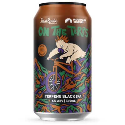
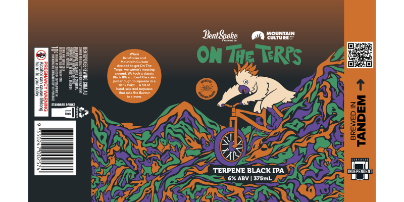
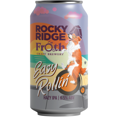
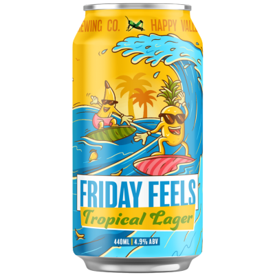
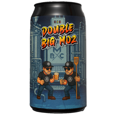
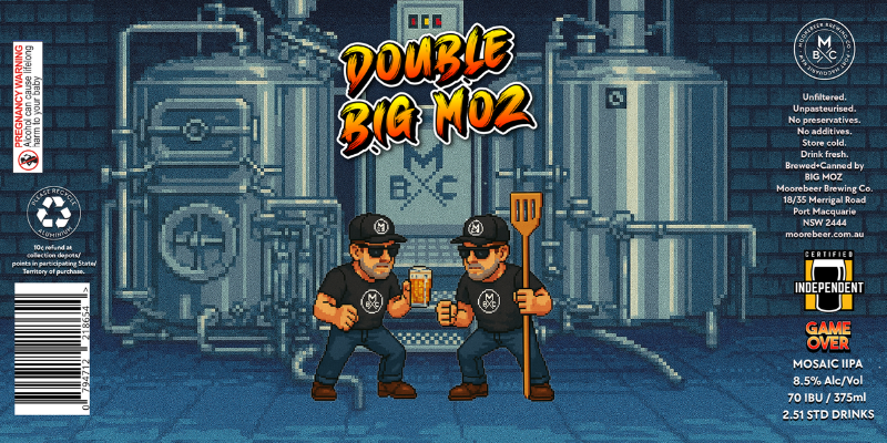
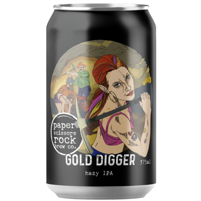
The Double Big Moz IIPA can design takes its cues from classic ‘80s arcade games — think Double Dragon or Final Fight, but set in the Moorebeer brewhouse. Featuring two pixel-art versions of Big Moz, it’s a nod to the no-nonsense, full-throttle energy behind this beer. One’s holding a schooner, the other a mash paddle — both ready to knock out boring beer in one hit.

Just like the label, the beer itself pulls no punches. It’s a clean, clear West Coast-style IIPA brewed with Mosaic hops, delivering bold bitterness, punchy citrus, and resinous swagger — no haze, no fluff.

This label is more than retro fun — it’s a reminder that beer can be big, brash, and crystal clear. Double the Moz, double the hops, double the attitude.

Mountain Culture Brewing Co

MIDSUMMAR SUN

Nakia Tyrrell

The brief for Midsommar Sun was simply to create a can so hypnotically beautiful that people would want to drink it, keep it, and possibly even join a cult over it. Majority of the inspiration came from the 2019 film, Midsommar, focusing on a key visual of the film, the flower crown, with the design leaning into the bright florals. The central point of the illustration is a radiant, human faced sun, surrounded by an explosion of wildflowers, reflecting the beauty and energy of midsummer celebrations. The palette shows warm golds, fiery reds, and deep blues that mirror the beers amber glow and the glowing light of a solstice evening. The result is a design that balances creativity and storytelling.

Mountain Goat Beer

Melbourne Magic

Laura Holley

A true celebration of Melbourne’s inconic culture – pure magic!

Inspired by Melbourne’s legendary coffee culture, this new release is a bold, copper-hued ale that brings together the warmth of rum, rich coffee, and toffee. A tribute to our heritage, this rare breed captures the magic of the city in every sip.

We teamed up with iconic Melbourne artist, Laura Drawz to create this iconic can design!

Mountain Monk Brewers

HONEYBIRD COFFEE MILK STOUT

Stephanie Bellman & Leah Hume

Each winter, we collaborate with our town’s coffee roasters, Honeybird Coffee, to create a sweet coffee stout with a cold press mild brew ‘Velvet Assassin’, all created in our brewhouse. This year, we wanted to visually demonstrate how Honeybird Coffee’s beautiful brew blends and flows deliciously with our milk stout beer base – while adding in some honeybirds to add character and brand kudos for our local roaster mates.

Nail Brewing

Hammerhead Juicy Haze

Jarrod Fuller 

So with the brand called Nail Brewing, and WA such a shark infested area, I thought correlation between the area and the name Nail worked well with hammerhead. Then after that with the beer being hazy and the shark colour contrast of hazy yellow/ orange and blue water worked well and stood out.

New England Brewing Co

Evil Lamb

Blair Sayer

We love a good yarn and Evil Lamb fits the bill. There’s always something that’s a surprise. Something that looks cute but is actually Evil. That’s Evil Lamb.

Noodledoof

Gutsy Extra Stout

Jimmy Buscombe

Like our beer, a wombats energy is grounded, resilient and steadfast. With it’s powerful claws, wombat can burrow deep within the earth to create a safe and secret haven.
He encourages us to, dig deep within ourselves when feeling threatened and find a true sense of security and inner sanctum.
Only when we are challenged do we truly discover our inner grit, determination and courage, and ultimately what it means to be Gutsy.

Ocean Reach Brewing

Shredalotl Coastal IPA

Alex Bismire

Shredalotl Coastal IPA can design captures the coastal spirit of Phillip Island with a burst of fun, energy, and a cheeky nod to surf-skate culture. Inspired by the idea of an axolotl with a fearless shredding persona, it features our playful underwater character cruising on a skateboard, surrounded by lightning bolts of tropical citrus flavour. Bold, high contrast colours mirror the beer’s bright, juicy profile, while the design reflects Ocean Reach Brewing’s laid back coastal vibe. Created to stand out on the shelf and spark a smile, Shredalotl invites drinkers to embrace good times, bold hops, and a dash of mischief.

Paper Scissors Rock Brew Co.

GOLD DIGGER

Elise Reading

Gold Digger is a hop heavy Hazy IPA, named not after those who chase wealth, but the hop varieties that pack this beer with a big juicy tropical punch. Eldorado and Eureka, names once soaked in a history of gold, now reward all the hard toiling women and men of the craft beer world in search of juicy flavour and a quenching finish.

Precinct Brewing

Experiment #40

Rhys Jacobson

Experiment #40 was Precinct’s 40th batch of a Hazy Style Beer made by our two mad scientist brewers Jeremy and Lachy. My mind went straight to a Breaking Bad laboratory utilising oranges and pinks for the beer it’s representing and the tropical vibes it gives off.

Prickly Pete and the Wolf Brewing Co

COMING TO AMERICA IPA

Tejet

The long sea voyages from country to country taking over six months, presented a significant challenge for beer preservation. Traditional ales and porters of the time often spoiled before reaching their destination due to the long journey and warm climate. To overcome the challenges of transporting beer on long sea voyages to India, brewers developed a pale ale with higher hop content and alcohol levels – IPA (Indian Pale Ale). This can design represents the shipping of the American IPA.

Project Brewing Co

LIQUID FLAVOURED TREAT

Matt John

Kinda looks like digging your hand into a bag of mixed chocolates, except instead of chocolate we’ve got a cat, an octopus, a cactus and a rabbit. It’d be weird if we didn’t do that.

Psycho Suzie's Brewing

Slither'in

Emery Greer

The label features a coiled snake guarding a sword a central icon in PSBCo’s branding since day one. We’ve made it our mission to weave the sword into every label, and this time we wanted it to sing loud and clear, marking a bold new creative direction for the brand.

With a fresh yellow and green palette that nods to the beer’s crisp character, and our new tagline “Slightly Deranged Beer For the Brave,” this design wraps up everything Psycho Suzie’s stands for fearless, fun, for anyone who doesn’t flinch at fangs.

Queens of Chaos Brewing

SKINNY DIP

Collaboration between Scott MacDonald, Fanie Thuot and James Armstrong

Besides wanting to showcase the flavours of pineapple and hibiscus, we wanted highlight co-owner, Courtney’s Canadian childhood by giving a nod to Ananas – the junkyard-dwelling, French-speaking pineapple (and the comedic musical troupe Les Squelletes) from the absolute fever dream that is Téléfrançais!

Téléfrançais is an educational series which aimed to teach all Canadian kids outside of Quebec how to speak French. Our good friends, and Canadian artists, Scott MacDonald and Fanie Thuot, understood the challenge like no one else could, et viola!

Range Brewing

DRIPPING IN GREEN: NELSON SAUVIN

Lachy Robinson

Dripping In Green has been a long-standing series at Range Brewing, and this refresh gives it a slick new makeover that shows just how far we push the boundaries of our hop saturation.

The can design bursts with a hyper-saturated green gradient that is oozing, melting, and bleeding over the typography. Printed over metallic to create a shifting motion when the can is moved. A design that quite literally drips in green.

Revel Brewing Co

KOME JAPANESE LAGER

Madie Woodford

At Kome, simplicity is our signature. Our minimalist can design is intentional, it cuts through visual noise and stands out on crowded shelves with clarity, elegance, and calm confidence.

Inspired by Japanese aesthetics, the design reflects values of precision, purity, and restraint, honouring the spirit of wabi-sabi and the craftsmanship behind every drop of Kome rice lager. This aesthetic isn’t just a design choice – it’s a statement. It aligns with a modern, design-conscious audience that values authenticity and understated luxury. Millennials and Gen Z, in particular, are drawn to brands that feel curated, culturally rooted, and visually refined.

Rocky Ridge Brewing Co

Dopamine Drip

Ethan Ashton

Dystopian but not depressing, colourful conversation starter, commenting on the counter phone and social media culture. Artwork inspired by Trinity from the matrix but plugged into lots of drips feeding from colourful hops, crushing a phone in her hands, cameras replaced with eyes popping out.

Running with Thieves

Japanese Mid Lager

Jack Birchmore

The Running with Thieves Japanese Mid Lager pairs clean design with precision detail – a nod to true craftsmanship. Featuring the Running with Thieves signature diamond pattern, the design allows the raw aluminium of the can to shine through, creating a subtle flicker of light as it moves, much like the polished steel of a Japanese Katana, honouring the methodology that goes into brewing the beer inside.
 
The bold red and crisp white palette takes inspiration from the Japanese flag and national colours, delivering a look that’s as striking as it is iconic. Minimal yet impactful, this design reflects balance, quality, and attention to detail.

Sailors Grave Brewing

iNTO THE PINES FOREST ALE

Joe Lyward

Inspired by our love of botanical drawings, collecting, the forest floor and foraging

Scarborough Harbour Brewing Co

Stoutnik One

Emery Greer from Demographic design

With a name like Stoutnik One, the mission was clear: capture the depth, darkness, and ambition of this barrel-aged Russian Imperial Stout — and make it feel like it truly came from space.

Seeker Brewing

OUT STANDING in the field

Michael Gallus

The name ‘Out Standing in the Field’ came about as punny commentary on how bloody good this year’s crop of Victoria Hops have been by by Ryefield Hops. It’s a nod to the hard working farmers as well as all the people behind the scenes who contribute in producing these awesome products that we get to play and experiment with.
Michael wasted no time in landing the brief by portraying the mighty hop centre stage in a country field theatre.

Shout Brewing Co

Golden Nectar Vol. 1

Beau Penton

The name “Golden Nectar” that the team had for the series reminded me of ancient cities in South America. It reminded me of the movie “The Road to El Dorado” and looking at how they drew inspiration of the patterns of ancient Azteccan artwork that they reference in the title sequence for the movie. It really meant we were able to create an artwork to consistently be used across the series and be recongisable on the shelf, allowing us to recolour for each iteration while still being identifiable as a Shout Brewing can with the bold stroke lines in the patterns.

Six String Brewing Co

RAM STEIN Märzen

Sharon Benson with stencil from Johnny Devilseed

Did the beer inspire the name or the name the beer? We’ll never know, but you can’t brew an epic German-style without a nod to the German heavy metal greats. Featuring an original ram’s head stencil by local artist and muso Johnny Devilseed, we kept the silver can bare to let the bold, street-art style design pop, just as if it were sprayed on a wall. Simple, striking and unapologetically rock ’n’ roll.

Slipstream Brewing

Stealth Mode Black IPA

Emery Greer

This design was all about keeping it sharp, dark, and a little bit dangerous. Designed to echo the beer’s covert character, the label uses a full matt varnish base with targeted spot varnish and metallic embellishments to bring out the aircraft and fine line details—rewarding a closer look. Modern typography and a disciplined colour palette keep things razor-sharp and refined—an understated approach that draws the eye and lands with quiet confidence. It’s a label that flies under the radar but makes an impact in hand, perfectly complementing the smooth, hop-forward Black IPA inside.

Spotty Dog Brewers

DOUBLE HANDLING

Dom Dinel

Double Handling generally refers to the inefficient practice of handling materials more than once when a single handling would suffice. A lot of inefficient double handling happens in breweries but for this beer we deliberately double decocted it.
 
For our Double Handling label, we wanted to reflect the awkward, manual process of double handling so sought to capture two sets of hands awkwardly holding a beer. In a fun twist, if you look closely the hands actually represent the shape fingers need to be in to create a dog shadow puppet (Spotty Dog… get it? Haha)!
 
Double Handling is in Spotty’s lager series where we often draw colour inspiration from German football teams so for Double Handling we were inspired by the colours of FC Bayern Müchens purple and black uniform.

Stockade Brewco

Stockade Japanese Black Lager

TBC

Created a black Japanese style lager, and commissioned the line to label cans. We wanted to make something stand out.

Straddie Brewing Co

Pacific ale

Gabriel D’Hage-Craig

Pacific Ale is inspired by Straddie’s iconic beaches and its world-class surfing culture, making it the perfect expression of Australia’s most loved craft style. The creative brief aimed to capture the island’s easy-going, adventurous spirit, its natural beauty—golden sands, sun-drenched beaches, and the Pacific Ocean lapping at the shore—and pay homage to the generations of surfers the island has produced and those yet to come.
 
The design features our signature brand colours, creating an instantly recognisable visual identity while reflecting the vibrancy of the coast. Metallic finishes on the surfboard, waves, and surfer evoke the glisten of sunlight on water. A bright yellow surfboard leaning against a Pandanus tree—a defining feature of Straddie’s beaches—is the central motif, which is also mirrored on the tap decals in-venue, reinforcing the connection between the can, the brewery, and the Straddie experience. Pacific Ale is approachable, expertly crafted, and unmistakably Straddie—a taste of the island in every sip.

Sydney Brewery

DREAM WEAVER DDH NEIPA

Gene Shorter

Dream Weaver DDHNEIPA was crafted to take beer lovers on a sensory journey, vibrant, hazy and full of imagination. The can design reflects this experience through the image of a serene woman with closed eyes, immersed in a dream. Above her head, aromatic “notes” float and swirl, a visual expression of the tropical passionfruit, citrus and stone fruit flavours inside. These elements, inspired by the Riwaka, Enigma and Topaz hops, weave together to create a scene that feels both tranquil and dynamic, just like the beer itself. The dreamy palette and flowing forms echo the beer’s silky mouthfeel, double dry-hopped juiciness and smooth finish. “Dream Weaver” is more than a name, it is a celebration of creativity, flavour and the art of bringing all the right elements together to make something unforgettable.

Tallboy & Moose

Stranger zings

Simon Massey Di Vallazza

The design for Stranger Zings draws its inspiration from the cult series Stranger Things, playing on the name and the show’s eerie “Upside Down” world. This sour beer brings together two bold, contrasting flavours – sweet strawberry and tangy black lime – that, despite their differences, work in perfect harmony. That interplay of opposites mirrored the concept of parallel worlds, inspiring the split-can design.
 
The top half bursts with vibrant red, representing the strawberry’s sweetness, while the bottom half features a fresh green for lime, both underpinned by a darker tone to nod to the depth and intrigue of black lime. Figures on bicycles and a lurking monster subtly reference the show, creating a playful yet mysterious visual that reflects the beer’s balance of the familiar and the unexpected.

The Social Brewers

St George Draught

Stellio Koutsis

St George Draught Lager is a beer for legends, not wankers – and the can had to match. The brief? Make it bold, make it local, and don’t make it look like it belongs on a yoga retreat. We took the old-school tale of St George and the dragon, gave it a modern, red-and-white vector glow-up, and stripped out anything that looked like it might whisper the words “hazy pale ale.”
 
It’s clean. It’s confident. It looks like it knows how to fix your mower and pour your beer. This can isn’t trying to win your heart with soft fonts or pastel gradients. It’s kicking down the door and shouting: “Crack me open, mate!” The design cuts through the craft clutter and lands exactly where it should – in your hand, ready for a proper drink.

Thirty Eight O Six Brewing

Vanilla Maple Porter

Michael Scott

Inspired by the sweet and full maple flavours of the beer, without forgetting the subtle vanilla notes, this autumnal can was created. The maple leaf being the centre of attention lets the beer lover know exactly what they’re getting, whilst the creamy vanilla colouring and the warm oranges and browns set the tone for a cosy, warm and inviting experience. Think cold winters day, fire crackling, can in hand, warming you up with every sip. The vibes of this can on the outside couldn’t compliment the delicious taste of whats inside any better if they tried.

Those Cans

Those cans hazy pale

Oasis Creative Design

Our vision was simple: to create the exact opposite of everything currently on the market. This is beer made by women, for women—crafted to glamourise beer and make you feel confident and sexy embracing Those Cans.

We kept the design minimalist and effortlessly aesthetic, setting ourselves apart from competitors while ensuring it complements, never clashes with, your outfit.

Tiny Fish Brew Co

WTF Red Ale

TBC

This can design was primarily inspired by the collaboration between our brewery Tiny Fish Brew Co and our friends at Woolstore Brewery. The ‘WTF’ name came about after experimenting with ways to bring the 2 brands (W)oolstore & (T)iny (F)ish together. The merged logo then influenced the approach to the rest of the design. My aim was to create something a little quirky, something eccentric that would embody a sense of ‘What The F-ness.’ I imagined a bizarre world where a fish would cross paths with a sheep, and this is design was the result. I hoped the bold name paired with the surreal-looking vintage fish-man and sheep-woman would provoke intrigue & cause to people to scratch their heads, and to ask themselves: WTF is this?

Tops Beer

Tops Draught

Mark Harley 

The Tops Draught can design draws inspiration from nostalgic Australian and South Australian draught beers, evoking a time when beer was simple and unpretentious.

As the sole product of our small brand, Tops Beer, the design reflects our back-to-basics brewing philosophy. In response to a shift away from overly hoppy, fruit-forward styles, Tops Draught revives the traditional Aussie draught—both in flavour and appearance. The classic colour palette of white, red, black, and gold pays tribute to iconic cans of the past, instantly conveying familiarity and heritage. Clean lines and a strong logotype (which includes the iconic Clarendon typeface) are a deliberate nod to the utilitarian branding of mid-century beer. The result is a crisp, no-nonsense design that mirrors the beer itself—straightforward, satisfying, and made for the everyday drinker.

Tumut River Brewing Co.

Hitchhikers pale ale

Creatik 

Tumut River Brewing Co. is a fiercely independent regional brewery with big character, bold beers, and a down-to-earth community spirit. Following the brewery’s closure in 2024, we wanted to reintroduce the brand with a fresh look and rebrand that is unapologetically bold, unapologetically local, proudly Aussie and unmistakably Tumut.

Urban Alley Brewery

Fuchsia West Coast IPA

Phillip Prastalo

Our theme this year was colour, so we went all in with a design that’s impossible to ignore. For Fuchsia, we drew inspiration from the electric energy of 80’s films and the sparkling West Coast glamour (being a West Coast IPA) of Los Angeles. The chrome-style logo nods to the metallic typography of classic movie posters, while the vivid pink and black backdrop captures the bold, high-contrast palettes that defined the decade. The liquid, almost neon texture, gives a sense of movement. It’s retro, it’s loud, and it’s unapologetically fun – everything Urban Alley and the 80’s stood for, reimagined for today’s craft beer lovers. Just like the beer inside, this design is big on character, full of attitude, and made to stand out.

Westside Ale Works

Art dog

Matt Symons

Art Dog brings Melbourne’s street art scene to life… in beer form. Our can stars Boston, our owner Jonathan’s cheeky dalmatian, caught spray-painting a laneway wall. Just like the bold graffiti that covers the city, this design is vibrant, playful, and full of personality. Inside, a spray of Mosaic hops delivers citrus and tropical punch over a crisp, biscuity base.
 
Fresh, balanced, and a little bit rebellious, Art Dog is a tribute to creativity, craft beer, and Melbourne’s laneway culture. It’s more than a can – it’s street art you can drink.

Wheatbelt Brewery

Wheatbelt BREwery IPA

In-house

In 1884, Edward Vivian Harvey Keane, lord mayor of Perth, established our property. I wanted to develop an iconic logo that combines the Winery Building he constructed and the Morton Bay Fig-trees he was famous for planting across W.A and S.A. This is my way of making sure he will never be forgotten for his momentous contribution to the developing of Western Australia, particularly the Wheat Belt. I’ve also thrown in a little good old Aussie humor, because, who wants to read about what beer tastes like when you can drink it!!!

Your Mates Brewing Co.

LARRY JR

Kaito Mihell

We’ve been working on this one for a while. We knew Larry’s 10th birthday was coming up, but we weren’t quite sure how to celebrate him properly. As we’ve grown up alongside the Your Mates brand, so has our drinking style. We kicked this thing off in our early twenties and while the long weekend benders have slowed down, the good times definitely haven’t. So we figured if we’ve matured a little, maybe Larry should too.

And in true Larry fashion he has gone one better. Somewhere along the way Larry had a kid. Larry Jr has the same party shirt and the same easy going spirit. He is a chip off the old block. A mid strength pale made for Queensland sunshine, laughs with mates and good time adventures. He is here to keep the party rolling without slowing you down.