The GABS Label Design Awards, presented by Orora, is excited to announce the top 10 finalists, selected by public voting!
After careful deliberation, our expert judging panel has determined the final rankings, and the winners have been revealed! Grab a cold beer and explore these top selections in our virtual gallery below. Congratulations to all the winners!
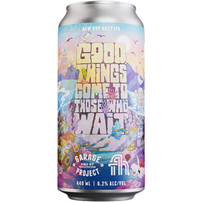
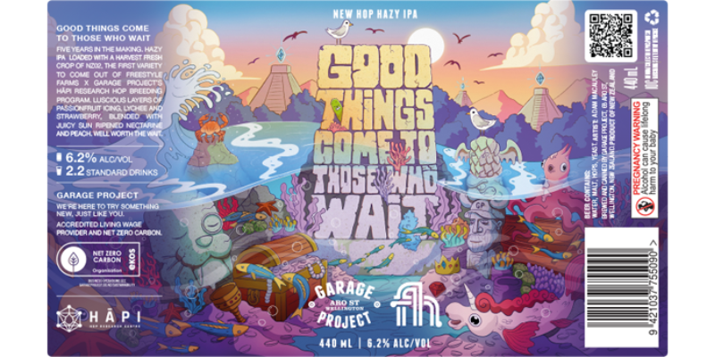
#1 Garage Project
Good Things Come To Those Who Wait
Adam Macauley
Good Things Come To Those Who Wait was a special brew, the first proper commercial release of a beer using NZ02, the first new hop variety to come out of the Hāpi Research breeding program that we have been involved in with Freestyle Farms. This release was the culmination of over five years of hard work. We wanted a label that spoke to the idea of hidden treasure finally discovered. It’s a lengthy name for a beer (to say the least), so we needed an artist who was comfortable incorporating text as well as images. We also wanted them to fill the art with hidden ‘easter eggs’ and references for the drinker to find. The artist, Adam Macauley, definitely delivered with a riotous label filled with fun and hidden GP references.
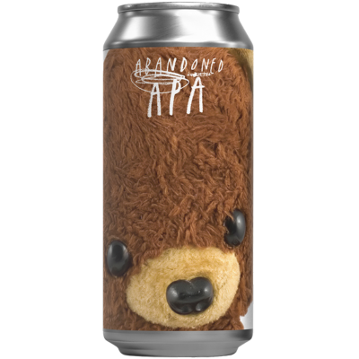
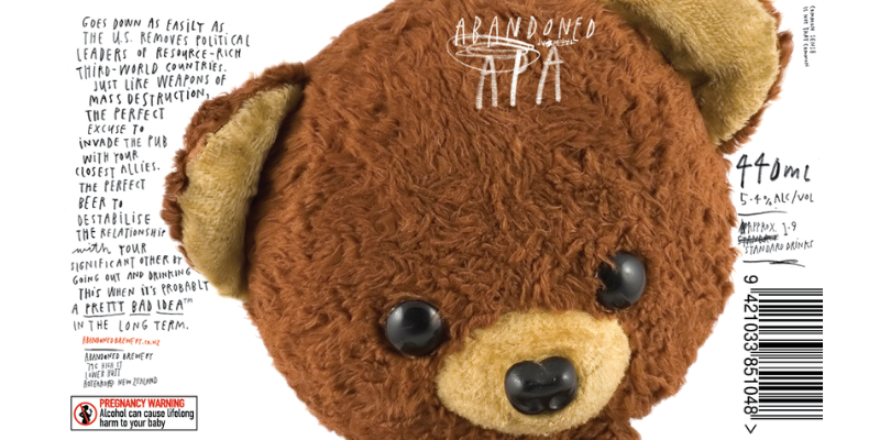
#2 Abandoned Brewery
APA
Aaron McKirdy
In an industry that at times feels like it’s resting on its laurels, our new can designs needed to be not only deep, but something rich and layered with meaning. Something that not only harnesses the brand idea of abandonment, but also creates a transcendent emotional connection with consumers.
We asked ourselves — what if a beer can could trigger a sense of childhood innocence? Refresh a weary mind, worn down with life’s trials and inequity? Remove the mask of judgment and prejudice born out of the struggle to understand the fellow man on anything more than a purely superficial level? Bring people together while raising a middle finger to conventional design sensibilities through embracing childhood nostalgia? And… simultaneously convey the world’s dumbest pun?
Introducing Abandoned Bears — Don’t overthink it.
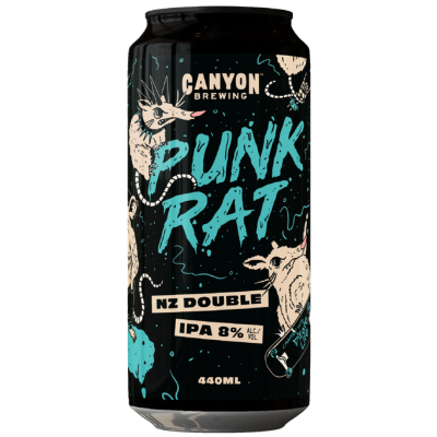
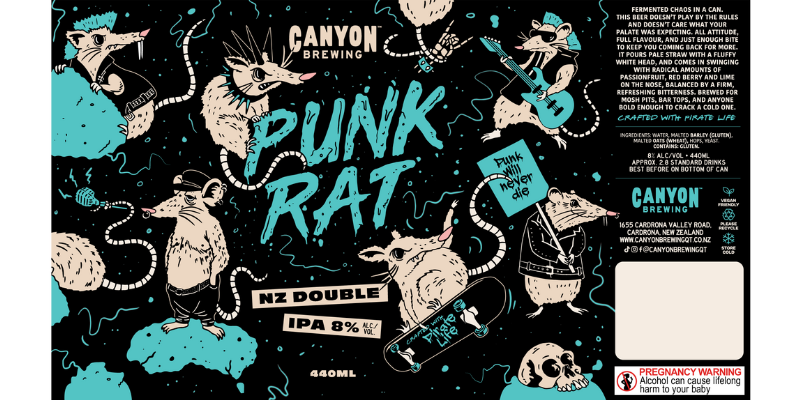
#3 Canyon Brewing
Punk rat - nz double ipa
Mikaela Turner
Punk Rat was brewed with our mates at Pirate Life as they celebrate their 10th birthday and the music that built them. The brief was simple: put punk in a can. We pulled cues from 90s skate-punk posters, DIY zines, sticker-bombed decks and bands that played by their own rules. Think loud type, rough edges and deliberate chaos. The palette nods to Pirate Life, the attitude is pure Canyon. It’s designed to jump off the shelf, scuff a few knees, and quench in a mosh pit. For the rule-breakers and rail-sliders, the ones who like their beer loud and their graphics louder.
Punk Rat beats to its own drum, a gritty little tribute to the bands, backrooms and basement gigs that made us fall in love with this scene.
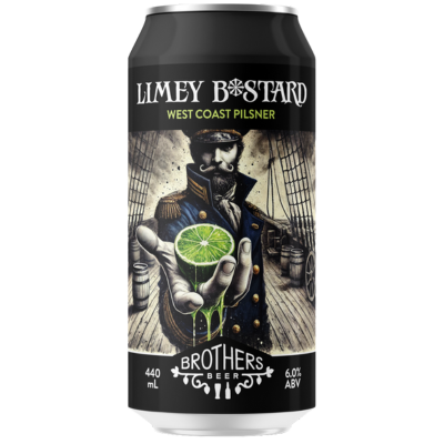
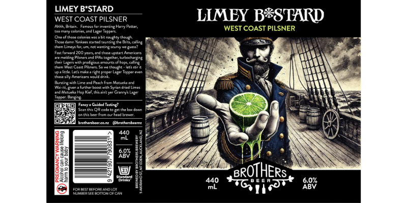
#4 Brothers Beer
LIMEY B*STARD
Scott Taylor
We thought, ‘what if we took that most British of things, the Lager Topper, and gave it the American craft treatment?’ From there it was an easy step to connect the friendly insult ‘Limey’, a term Americans delight in calling anyone British.
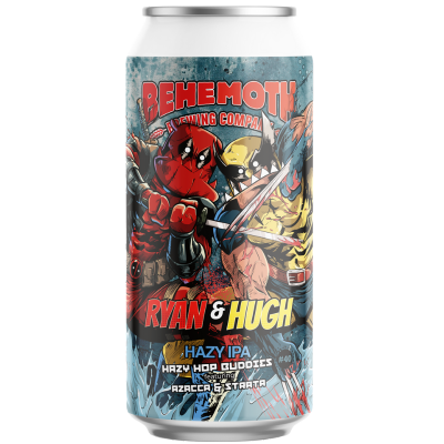
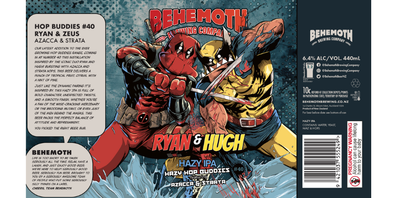
#5 Behemoth Brewing Company
Hop Buddies ryan & hugh
Nick Lurman
With Hop Buddies #40: Ryan & Hugh, we wanted to capture the chaotic charm and irreverent fun of one of pop culture’s most iconic duos. Inspired by the release of Deadpool 2 and the legendary on-screen chemistry of Ryan and Hugh. The label brings Churly into the mix, suited up as these unmistakable heroes.
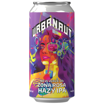
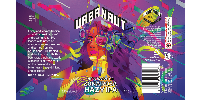
#6 Urbanaut Brewing Co
NEW WAVE 04 - ZONA ROSA HAZY IPA
Pablo Espinosa
Our NEW WAVE series embraces the future of beer using new and experimental hops and our label reflects that futuristic vision with a neo-tech ‘cyberpunk’ look and feel. The future is now!
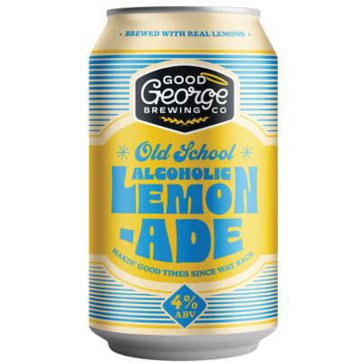
#7 Good George
OLD SCHOOL LEMONADE
Allan Cave
Good George Old School Lemonade takes its cue from the kind of lemonade your grandma used to make the real deal. Think back to lazy summer afternoons, the tang of freshly squeezed lemons, and the clink of ice in a tall glass on the veranda. We wanted to capture that simple, homemade magic, so we kept it honest: zesty citrus, a touch of sweetness, and a refreshing bite that takes you straight back to the good old days. The artwork nods to that nostalgic charm warm, hand-crafted, and a little cheeky just like a visit to Grandma’s.
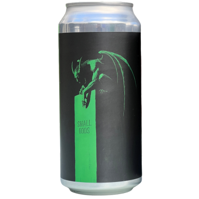
#8 Small Gods
Gargoyle
Luke White
We have a series of IPAs that are all named for monsters and cryptids. This beer was heavily inspired by the Californian IPAs that changed everything in the 90s and one in particular. Gargoyle is our homage to the iconic Stone IPA. The label references the colour scheme of that beer and the art is our take on their gargoyle logo.
The minimalist execution and rough strokes continue a style I’ve enjoyed illustrating for other beers in the series including Hoofman, Mothman, and Chichuna. Among all the wonderfully colourful and complex labels we see in beer fridges, I often enjoy seeing how monochrome and minimal I can go while still having a striking image.
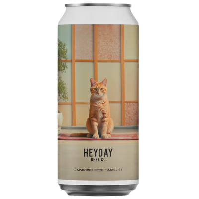
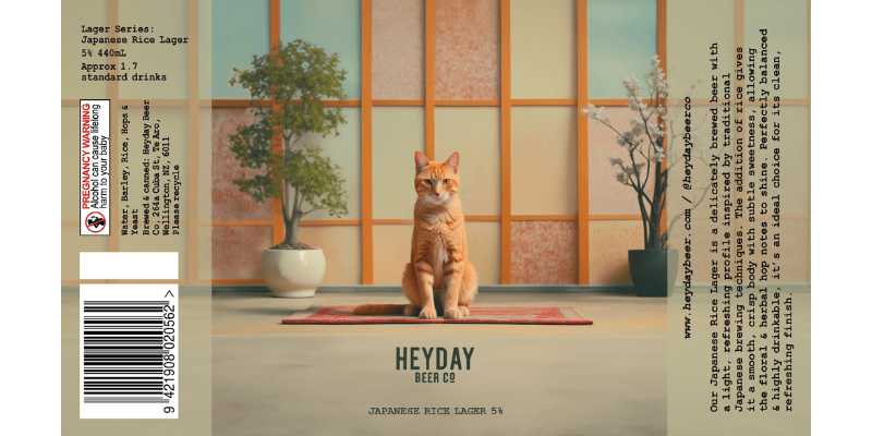
#9 Heyday Beer Co
Japanese Rice lager
Hannah Blackwood
This Japanese Rice Lager is one scene in our Lager Series by Heyday Beer Co, a two-year run of lagers sharing a single cinematic universe. Each beer is a frame from a film that doesn’t exist, featuring symmetry, muted colours & that offbeat Wes Anderson feel. This is our Japan scene: calm, charming & with a touch of Heyday signature… a cat, of course. Built on a consistent design system, the series evolves organically, making every release both familiar & fresh. It’s not just a beer label, it’s a frame from the world of Heyday.
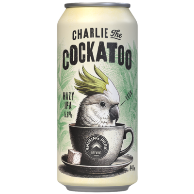
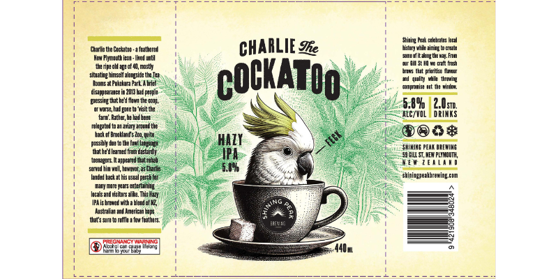
#10 Shining Peak Brewing
Charlie the cockatoo
Anton Hart
A celebration of Charlie, the Cockatoo who graced the local botanical gardens in New Plymouth for many years. All our beers celebrate a story, identity or artefact of our region, Taranaki.